Show progress based on field value

We recently helped someone with creating a progress at the top of their details page to show status and what’s remaining based on a field value.

Something along these lines:

progress gif

If this can be beneficial to you as well, here’s the how to implement this. This requires a few steps but some copy and paste can easily get you there.

  1. We have a radio field with 4 options. Take note of the field id (field_222 in my case):
    image

  2. Inside your details page add an HTML component and paste the following code into the source. Be sure to update this to match the field values you have in your app.

    <div class="container">
    <div class="wrapper">
    <div class="arrow-steps clearfix component-3-progressbar">
    <div class="step" data-id="Open">Open</div>
    <div class="step" data-id="Started">Started</div>
    <div class="step" data-id="Pending">Pending</div>
    <div class="step" data-id="Completed">Completed</div>
    </div>
    </div>
    </div>
    
  3. Add this to the Javascript of your page:

    TB.render('component_3', function (data) {
     jQuery('.component-3-progressbar > div').removeClass('current');
     jQuery('.component-3-progressbar > [data-id="'+data.record.field_222+'"]').addClass('current').prevAll().addClass('current');
    });
    

Change field_222 and TB.render('component_3, to the component id of your details component. The details component must contain the radio field.

Finally add this CSS to your page:

.arrow-steps .step {
	font-size: 14px;
	text-align: center;
	color: #666;
	cursor: default;
	margin: 0 3px;
	padding: 10px 10px 10px 30px;
	min-width: 180px;
	float: left;
	position: relative;
	background-color: #d9e3f7;
	-webkit-user-select: none;
	-moz-user-select: none;
	-ms-user-select: none;
	user-select: none; 
  transition: background-color 0.2s ease;
}

.arrow-steps .step:after,
.arrow-steps .step:before {
	content: " ";
	position: absolute;
	top: 0;
	right: -17px;
	width: 0;
	height: 0;
	border-top: 19px solid transparent;
	border-bottom: 17px solid transparent;
	border-left: 17px solid #d9e3f7;	
	z-index: 2;
  transition: border-color 0.2s ease;
}

.arrow-steps .step:before {
	right: auto;
	left: 0;
	border-left: 17px solid #fff;	
	z-index: 0;
}

.arrow-steps .step:first-child:before {
	border: none;
}

.arrow-steps .step:first-child {
	border-top-left-radius: 4px;
	border-bottom-left-radius: 4px;
}

.arrow-steps .step span {
	position: relative;
}

.arrow-steps .step span:before {
	opacity: 0;
	content: "✔";
	position: absolute;
	top: -2px;
	left: -20px;
}

.arrow-steps .step.done span:before {
	opacity: 1;
	-webkit-transition: opacity 0.3s ease 0.5s;
	-moz-transition: opacity 0.3s ease 0.5s;
	-ms-transition: opacity 0.3s ease 0.5s;
	transition: opacity 0.3s ease 0.5s;
}

.arrow-steps .step.current {
	color: #fff;
	background-color: #23468c;
}

.arrow-steps .step.current:after {
	border-left: 17px solid #23468c;	
}
9 Likes

@moe this is really helpful. Would it be possible using a standard dropdown with “inline edit” enabled, instead of a radio field? It would be fine if we had to refresh the page for it to update.

It would even be ok if it didn’t update in real time, but instead just reflected the corresponding value of our “status” field. Our projects have long lifecycles, so the status doesn’t update all that often. What would the JS look like for that to occur?

Do you mean the actual options are clickable? This code should work with radio or dropdown field unless I’m missing something?

1 Like

Hey @james! :wave: Is this what you’re looking for?

Select Progress

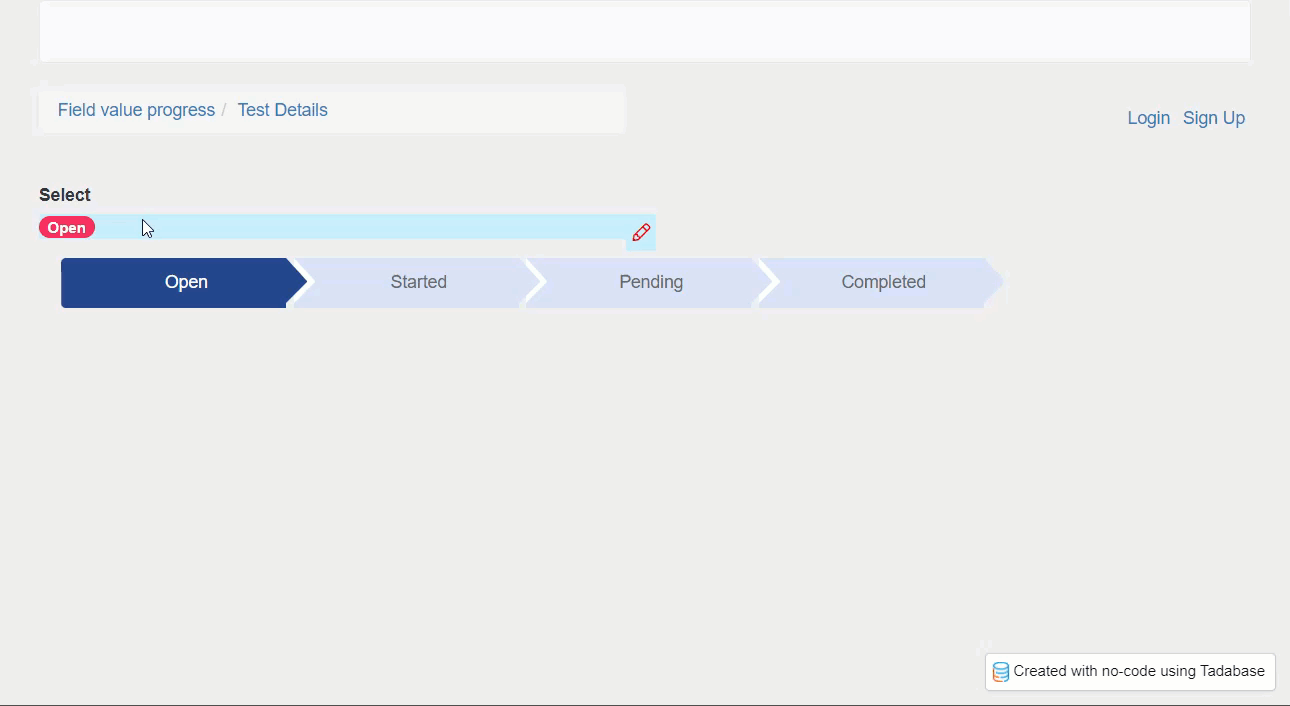
Paste the following JavaScript, then change ‘field_X’ on line 1 and ‘component_X’ on line 2

const FIELD_ID = 'field_X';
TB.render('component_X', function (data) {
    var init = function(val){
         $('.component-3-progressbar > div').removeClass('current');
         $('.component-3-progressbar > [data-id="'+val+'"]').addClass('current').prevAll().addClass('current');
    };
    $('#field_block_'+FIELD_ID+' > div.allow-inline-edit').click(function(){
        setTimeout(function(){
            $('body > div.modal.popover-modal.fade.in > div > div > div.popover-inner > div > div > select').on('change',function(){
                init($(this).val());
            });                 
        },500);
        $('body > div.modal.popover-modal.fade.in > div > div > div.popover-inner > div > button').on('click',function(){
            init();
        });  
    });
     init(data.record[FIELD_ID]);
});
5 Likes

I have tried this now many times, but I don’t get it to work @Chem
It is now in the code snippets, so I thought let’s try it again.

Just to get confirmation:

  1. In TB.render we have component-id of the details component containing the radio field, right? so, not the html component,right?

  2. jQuery is used. This is standard available in Tadabase, right? I don’t have to put a link in custom header/footer in Tadabase settings, right?

@Peter I believe you do actually need to add JQuery to the footer

<script src="https://cdnjs.cloudflare.com/ajax/libs/jquery/3.6.1/jquery.min.js" integrity="sha512-aVKKRRi/Q/YV+4mjoKBsE4x3H+BkegoM/em46NNlCqNTmUYADjBbeNefNxYV7giUp0VxICtqdrbqU7iVaeZNXA==" crossorigin="anonymous" referrerpolicy="no-referrer"></script>

Hey @Peter!

  1. Yes, the Component ID is for the Details Component
  2. Correct, jQuery is loaded into every Tadabase app by default without the need to put anything in the custom Header/Footer code

One common mistake I see that maybe you can check is to make sure to put the HTML code in the Source Code and not within the main part of the HTML Component.

It works, as it is supposed to. I made a stupid mistake in the spelling of the field values - this is why it didn’t work. It must be exactly the same in both components.

1 Like