Rez
1
Hi everyone!
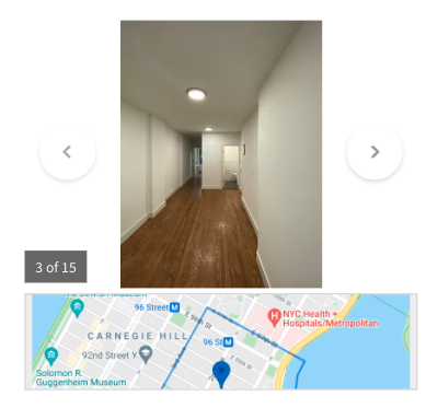
I’m looking to display pictures stored in an Attachments field as a gallery, doesn’t have to be fancy, something like this would do it:

Has anybody figured out a nice way to showcase photos on pages?
Thanks in advance, and please let me know if you have any ideas!
moe
2
I think the only way to really achieve this would be with a custom component. I’ve seen this done many times.
I’ll ask a team member to make a simple code snippet and will post it back here in the coming days.
Here’s a live example:

This same concept can be applied with nearly any slider library.
2 Likes
moe
3
Here’s some sample code you can use to use a slider in the custom component.
Inside the HTML section of the custom component add this code. In my case field_250 is the attachments field, make sure to update it accordingly.
{{#each records}}
<div class="col-sm-12 attach-slider-section">
   <div class="row">
        <div class="col-sm-8 attach-slider-wraper">
            <div class="attach-slider-box">
                <div id="myCarousel" class="carousel slide" data-ride="carousel">
                    <div class="carousel-inner">
                        {{#each obj.field_250}}
                            <div class="item">
                                <img src="{{url}}"  class="attach-slider-image" >
                            </div>
                        {{/each}}
                    </div>
                    <div class="col-sm-12">
                        <!-- Indicators -->
                        <ol class="carousel-indicators">
                            {{#each obj.field_250}}
                                <li data-target="#myCarousel" data-slide-to="0" class="attach-slider-nav" style="background: url('{{url}}');"></li>
                            {{/each}}

                        </ol>
                    </div>
                </div>
            </div>
        </div>
    </div>

</div>
{{/each}}
CSS Code:
.attach-slider-section {
    padding-top: 2.5rem;
    padding-bottom: 2.5rem;
}
.attach-slider-box{
    margin-top: 2rem;
    padding-bottom: 2rem;
}
.attach-slider-image{
    width:100%;
    height:627px;
    border-radius: 10px;
}
.carousel-indicators{
    position: relative;
    top: 15px;
    width: 100%;
    padding-left: 0;
    text-align: left;
    margin-left: -15px;
    left: 0;
    margin-bottom: unset;
}
.carousel-indicators .active{
    opacity: unset;
}
.carousel-indicators li{
    border-radius:9px !important;
    opacity: 0.5;
}
.attach-slider-nav{
    height: 68px !important;
    width: 103px !important;
    background-repeat: no-repeat;
    border-radius: unset !important;
    background-size: cover !important;
}

@media only screen and (max-width: 991px) and (min-width: 768px){
   .attach-slider-wraper{
   		display:block;
   		width:100%;
   }
}
Javascript Section:
$( document ).ready(function() {
    var slidDiv = $(".carousel-inner").find(".item");
    var numInc = 1;

    $( slidDiv ).each(function() {
        if(1 == numInc){
            $( this ).addClass("active");
        }
       numInc++;
    });

    var carInd = $(".carousel-indicators").find(".attach-slider-nav");
    var carInc = 0;
    $(carInd).each(function(){
        if(0 == carInc){
            $( this ).addClass("active");
        }
        $( this ).attr('data-slide-to',carInc);
        carInc++;
    });
});
3 Likes
Rez
4
This example you posted is great, @moe, thank you so much, I will implement and get back to you with feedback!
Rez
5
Hi @moe, it looks good, but I was wondering if you could help me hide the “Refresh” bar on top of the gallery?
I realize there aren’t any slider templates yet, but I am looking forward to them!
See how it looks with the code you provided:
Hey @Rez,
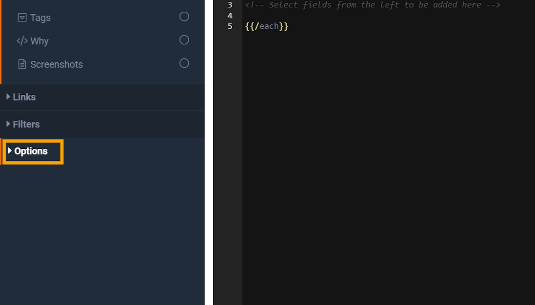
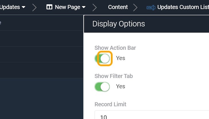
There is an option within the Custom Component that allows you to disable the Action Bar.
1. Click on Options
2. Toggle "Show Action Bar" to Off
1 Like
Rez
7
Always so helpful, thanks Tim!
1 Like
