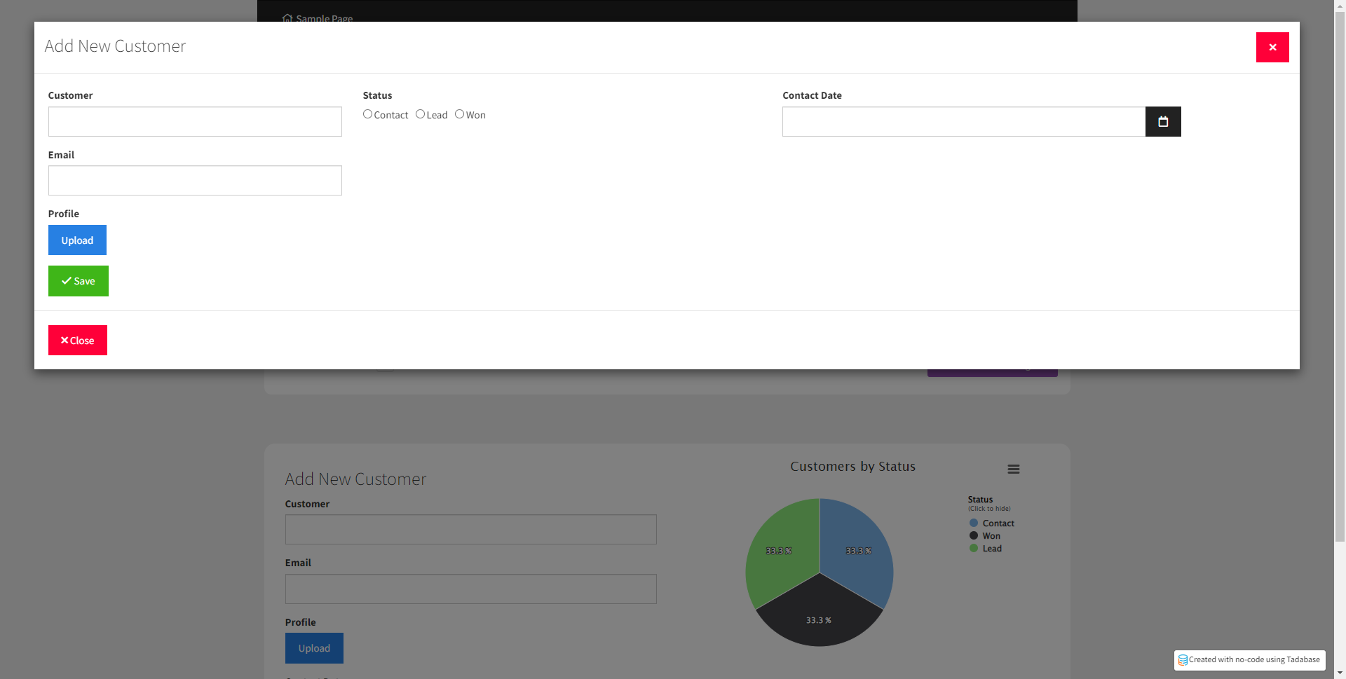
Most of my app revolves around tables as a starting point. When I include an “add new record” button to a table, the Add screen is a modal. I have some large forms in my app and when the modal pops up things can be quite congested.
Does anyone have any suggestions for making modals larger?
I’m wondering if there is a way to have Add New open as a page instead of a modal? I might have missed an option for this?
I’ve learned a two-part method of using a modal to begin the form with a few “starter” fields, then redirecting the user on save to an edit screen with all the fields (and more real estate) to finish the form submission, but this seems a bit unintuitive for the user.
Any other creative solutions to this?