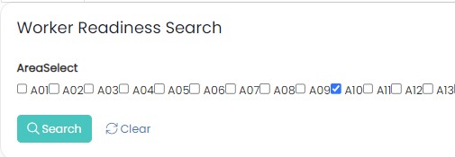
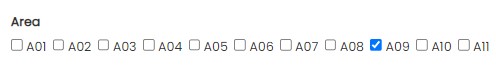
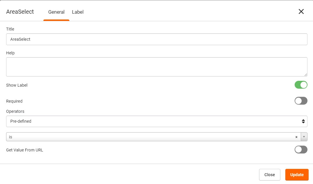
I like using the Predefined “Is” option for a Select field type to show checkboxes for all available options.
But the format adds a single space between the checkbox and each option, and no space between each option and the next checkbox. I would like to be able to specify padding on the left and right of each option. For example, in the screenshot below, I have selected A10, but the checkbox is actually closer to A09. So I might want to remove the space before A09 and add one or two spaces after A09. It’s confusing to users the way it is now.