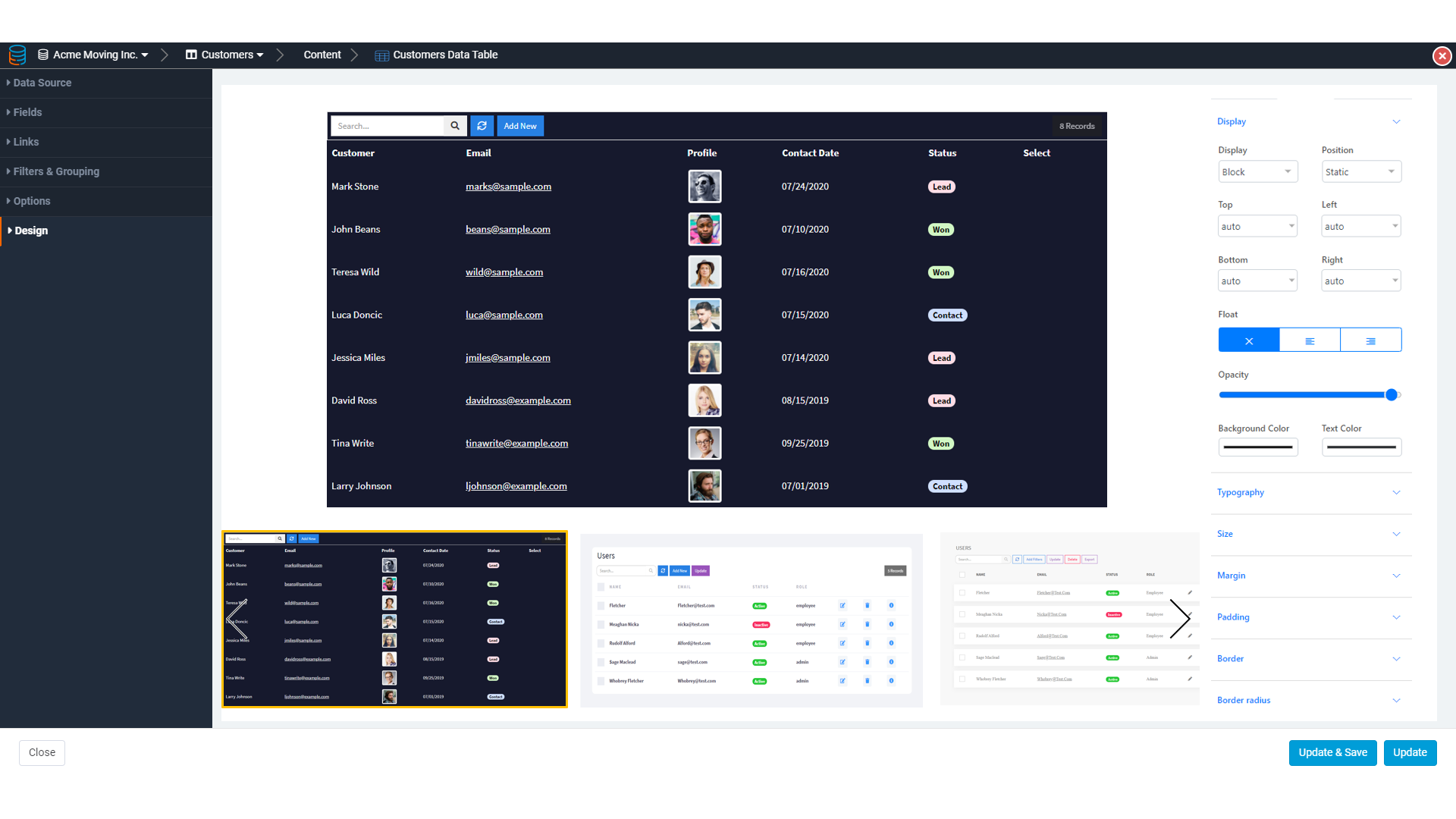
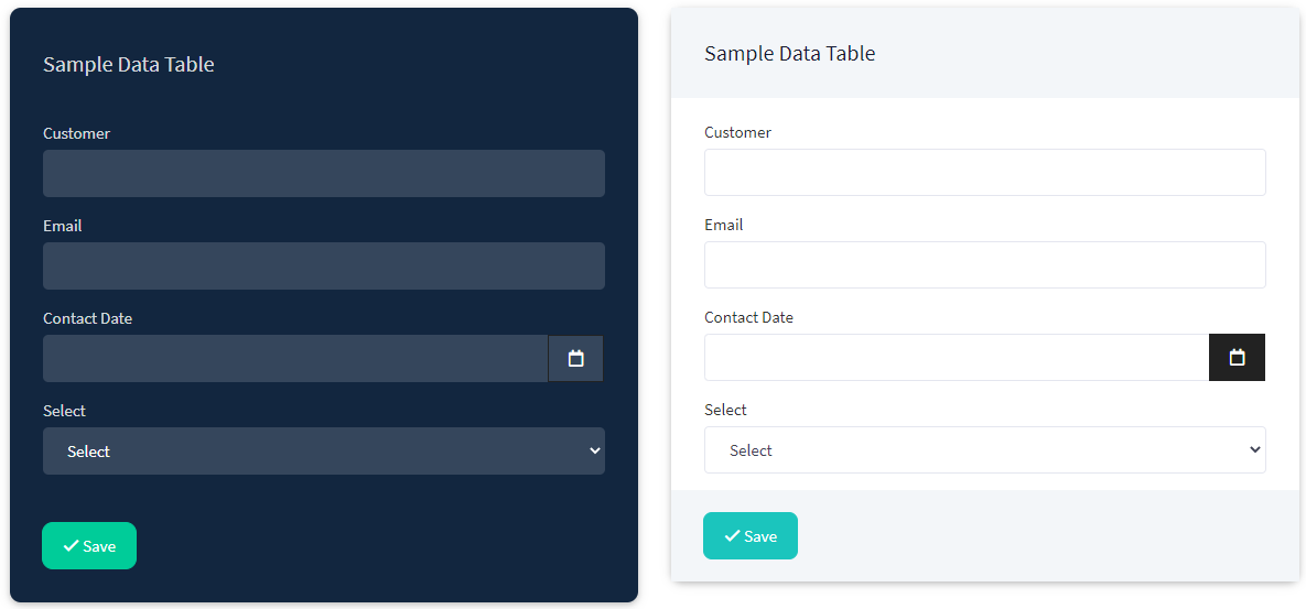
It would be great to have the ability to add a custom theme. This would allow the use of a custom color palette (same colors as a corporate logo).
Current workaround (not ideal, but works):
Right now, the way to change colors is to add a custom header with a lot of CSS color definitions.
For instance:
<style>

.btn-primary {
background-color: #2e70bb;
border: 1px solid #2e70bb;
}
.btn-primary:hover {
background-color: #1D4676;
border:  1px solid #1D4676
}
.btn-outline.btn-primary {
background-color: #FFFFFF;
}
.btn-outline.btn-primary:hover {
background-color: #2e70bb;
}


.btn-danger {
/* background-color: #f2366b; */
background-color: #F82F60;
border: 1px solid #F82F60;
}
.btn-danger:hover {
background-color: #AE0B39;
border: 1px solid #AE0B39;
}
.btn-outline.btn-danger {
background-color: #FFFFFF;
}
.btn-outline.btn-danger:hover {
background-color: #F82F60;
}

.btn-success {
background-color: #45befc;
border: 1px solid #45befc;
}
.btn-success:hover {
background-color: #0385C6;
border: 1px solid #0385C6;
}
.btn-outline.btn-success {
background-color: #FFFFFF;
}
.btn-outline.btn-success:hover {
background-color: #45befc;
}

.btn-info {
background-color: #4D4D4D;
border: 1px solid #4D4D4D;
}
.btn-info:hover {
background-color: #303030;
border: 1px solid #303030;
}
.btn-outline.btn-info {
background-color: #FFFFFF;
}
.btn-outline.btn-info:hover {
background-color: #4D4D4D;
}

.btn {
border-radius: 4px;
}

.btn-success {
 border-radius: 24px;
 text-align:center;
}

.badge-wh-2 {
  background-color: #24C65A;
}
.badge-wh-3 {
  background-color: #45befc;
}

</style>