What page layouts are you using for mobile views in Tadabase, and which have worked best for you?
Some work better than others, but I haven’t had the results that I’d like from any that I’ve tried. I’m at the point of trying to find another solution for mobile access. No good ideas yet though.
Hi @daniel, thanks for responding.
Can you tell me which of the existing Tadabase layouts worked better than the others for you, even if only slightly? Was it more around navigation, responsiveness, usability, performance, or something else?
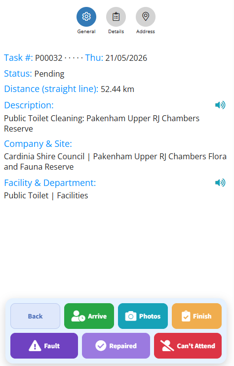
I’ve started creating my own floating button panels and custom mobile menu systems to improve phone usability, and I’ve been experimenting with replacing/supplementing the default TB navigation experience.
My main goal is to reduce tap depth and make larger operational apps feel more “app-like” on mobile devices.
I’m still unsure whether this is the right long-term direction inside the Tadabase environment though. Part of me feels like I may be recreating functionality that could eventually be solved natively.
This is the style of what I am currently working on, but maybe I would be better off extending the existing TB menu structure with custom options instead.
I’d also be interested to hear how others are approaching mobile UX in Tadabase:
- Are you mostly adapting desktop layouts?
- Building separate mobile-focused pages?
- Using custom CSS/JS heavily?
- Or avoiding complex mobile workflows altogether?
It feels like mobile usability is still one of the bigger challenges when building larger Tadabase apps.