Hi,
When I add an option and go to add more as the icons move I often then delete the option I just added.
Can the 3 icons always be shown so they don’t move but just grey out the first options delete if there is only the one option?
Thanks
Dan
Hi,
When I add an option and go to add more as the icons move I often then delete the option I just added.
Can the 3 icons always be shown so they don’t move but just grey out the first options delete if there is only the one option?
Thanks
Dan
@Dan-
Can you give an example (screenshot or video) of what you are encountering? I’m not completely clear on what you are asking for.
Thanks,
Adam
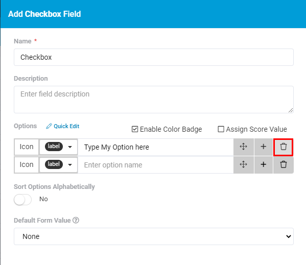
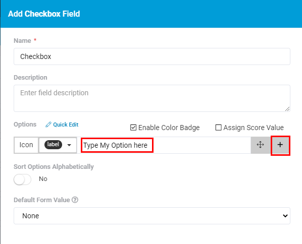
Hi Adam,
So as below when you add your first Option there is the + button to the far right, so I know I want 4 options so I hit it 4 times, but as below after a second option appears it changes from the + button to the Delete button so I delete the Option I just set.
So I mean keep the 3 buttons in the same position when 1 or more than 1 option but just disable it when only 1 option.
Thanks
Dan
You’re absolutely right. We’ve put a lot of effort recently into a new updates UI/UX experience. It’s currently in limited testing and we hope to have this live very soon to everyone.
This change you’re suggesting will certainly be implemented in the very near future as well.
Here are some screenshots from the latest updates:
We’ve added filtering, sorting, saved views, keyboard controls and much much more.
Hi Moe,
Looks good as always, can’t wait.
Thanks
Dan