tenny
November 3, 2020, 7:51am
1
Hello kind hearts,
I got a question which maybe basic but don’t know how to fix out:
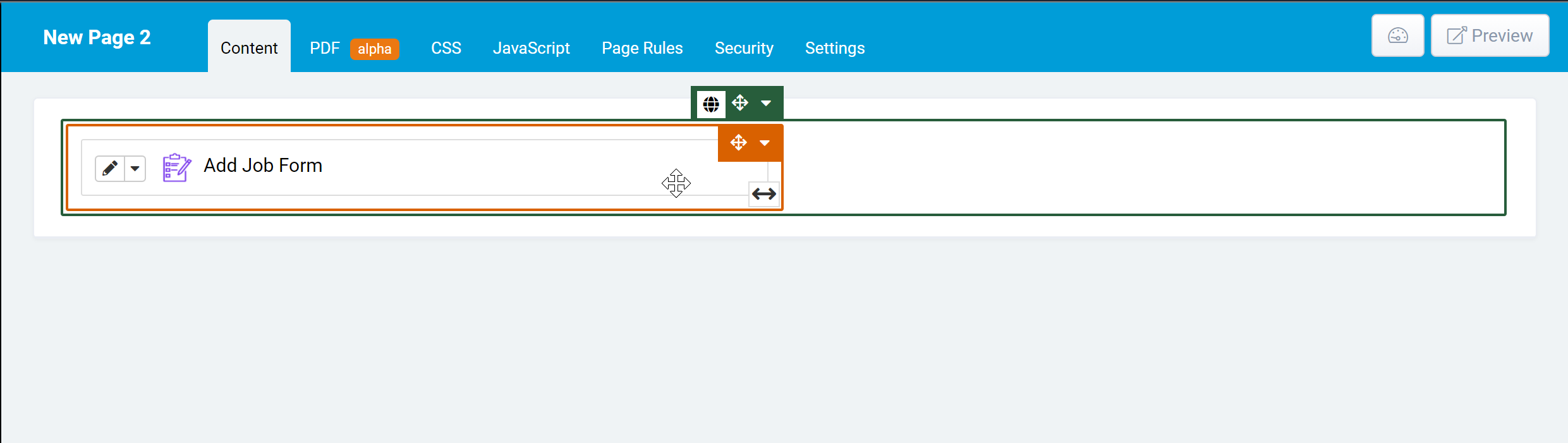
I would like to create a column that can align to the right and leave the left hand side blank. I used the method to set the margins but it’s not universal to view in all browsers, is there any ways to fix the outcome as this one (the black arrow)?
moe
November 3, 2020, 8:44am
2
If I understand correctly you’re looking to offset a specific column different amounts based on the size of the screen/browser?
If yes, you can use the offset class.
Suppose we have a page with a form that’s taking up half the row (size 6). Like so:
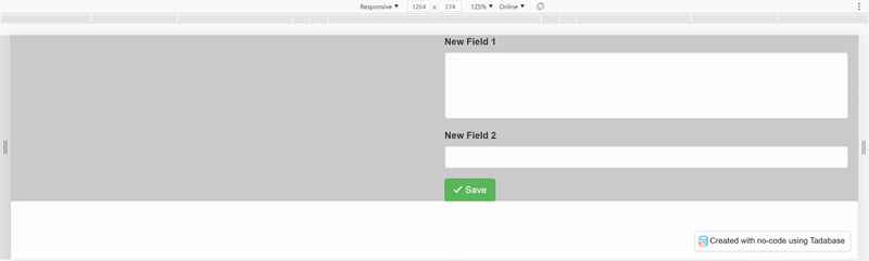
which translates into:
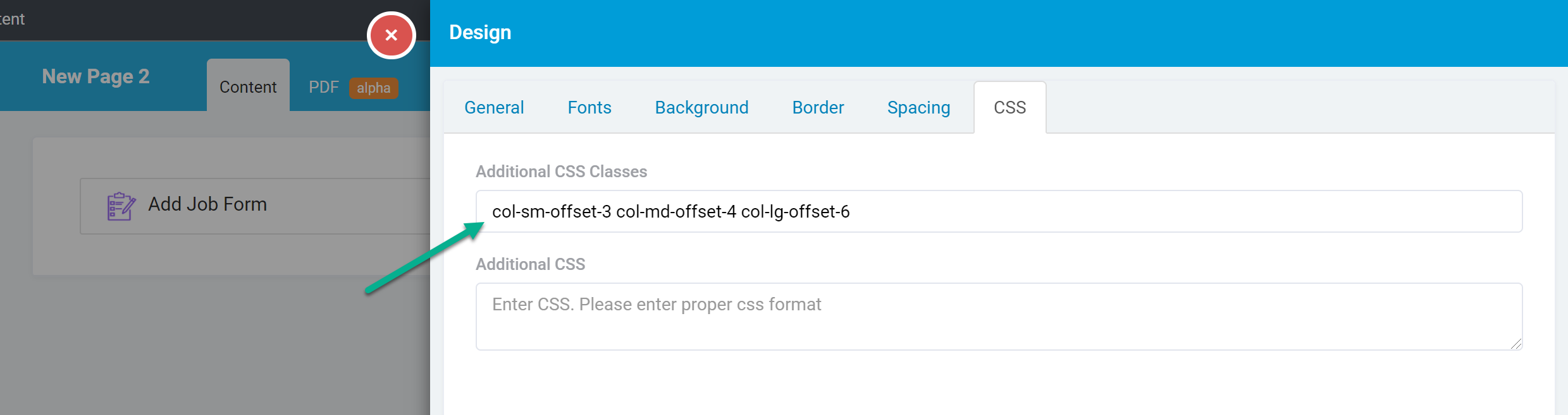
If you want the column with the form to be offset specific amounts based on screen size you can add different classes to the column.
Edit the column settings:
Add the offset classes you wish to use, for example if we put in:col-sm-offset-3 col-md-offset-4 col-lg-offset-6
It will offset the column by 3 on small screens, by 4 on medium screens and by 6 on large screens.
You can see the different classes you can use here:
https://getbootstrap.com/docs/3.3/css/#grid-offsetting
If this is not what you had in mind let me know and I’ll be happy to clarify further.
tenny
November 4, 2020, 3:56am
3
Thx Moe, I will play around on this and try. Also, do you have any recommended tools used to test the page on various browsers and device?
Thanks a lot…
Chem
November 4, 2020, 10:13pm
4
Hey @tenny
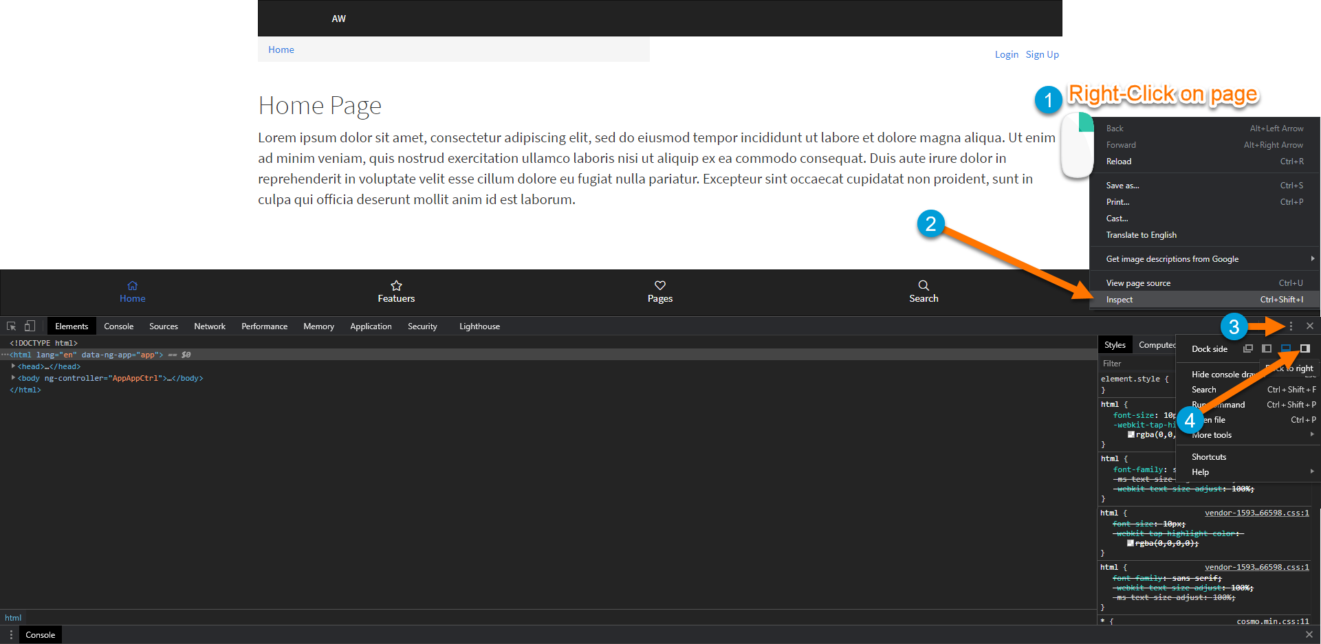
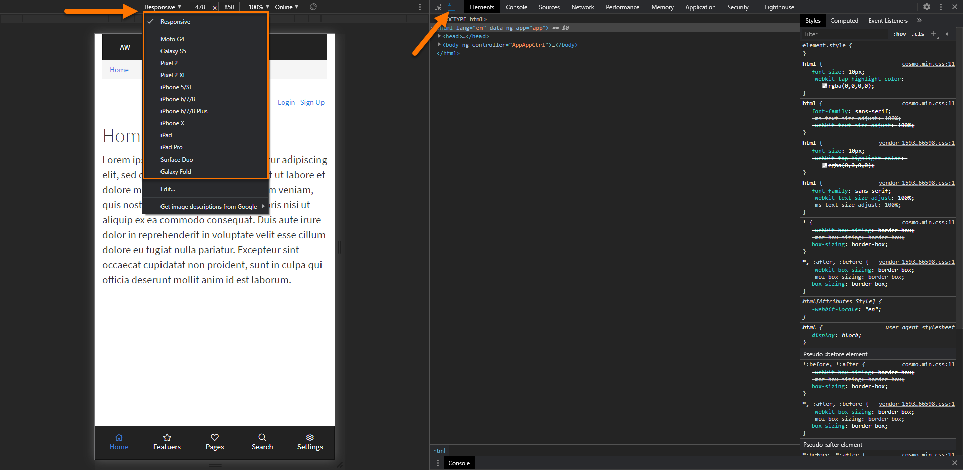
I like to use the Chrome “Toggle Device Toolbar” in the developer options to test out different screen sizes.
To view this you can open the Inspect chrome tool and setting the “Dock side” to “right” as shown in the image below
Then, click on the “Toggle device toolbar” option to pick from multiple device options or a custom device size by using the “responsive” option