Custom Badge Design - Colored Dot, Gray BG, Text

Hey TB Community-

Feel free to adjust as you see fit. Created a custom badge design that can be included in the Settings > Custom Header/Footer Code > Custom Header

/* --- BEGIN CUSTOM BADGE STYLES WITH DOT, ICON, AND CSS VARIABLES --- */
.badge {
  display: inline-flex !important;
  align-items: center;
  gap: 8px;
  font-weight: 600;
  padding: 5px 8px;
  border-radius: 5px;
  font-size: 12px;
  line-height: 1;
  vertical-align: middle;
  position: relative;
  background-color: #ededed !important; 
  color: #222 !important;
}

/* Dot styling */
.badge::before {
  content: '';
  display: inline-block;
  width: 8px;
  height: 8px;
  border-radius: 50%;
  margin-right: 6px;
  background-color: var(--badge-dot-color, #999);
  transition: transform 0.2s ease;
}

/* Animate dot on hover */
.badge:hover::before {
  transform: scale(1.2);
}

/* Remove dot with .no-dot */
.badge.no-dot::before {
  display: none !important;
}

/* Font Awesome icon spacing */
.badge i {
  margin-right: 6px;
  font-size: 90%;
}

/* === Dot Colors for .badge-wh-* === */
.badge-wh-1  { --badge-dot-color: #7B3CEC; }
.badge-wh-2  { --badge-dot-color: #25C836; }
.badge-wh-3  { --badge-dot-color: #1EBEFF; }
.badge-wh-4  { --badge-dot-color: #FF6F30; }
.badge-wh-5  { --badge-dot-color: #F82F60; }
.badge-wh-6  { --badge-dot-color: #8A48FF; }
.badge-wh-7  { --badge-dot-color: #FF10C1; }
.badge-wh-8  { --badge-dot-color: #FCB303; }
.badge-wh-9  { --badge-dot-color: #317EF9; }
.badge-wh-10 { --badge-dot-color: #000000; }

/* === Dot Colors for .badge-bk-* === */
.badge-bk-1  { --badge-dot-color: #cfdfff; }
.badge-bk-2  { --badge-dot-color: #d0f0fd; }
.badge-bk-3  { --badge-dot-color: #c2f5e9; }
.badge-bk-4  { --badge-dot-color: #d1f7c4; }
.badge-bk-5  { --badge-dot-color: #ffeab6; }
.badge-bk-6  { --badge-dot-color: #fee2d5; }
.badge-bk-7  { --badge-dot-color: #ffdce5; }
.badge-bk-8  { --badge-dot-color: #ffdaf6; }
.badge-bk-9  { --badge-dot-color: #ede2fe; }
.badge-bk-10 { --badge-dot-color: #eeeeee; }


/* --- END CUSTOM BADGE STYLES WITH DOT, ICON, AND CSS VARIABLES --- */

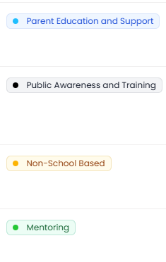
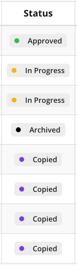
The results look like:

NOTE: Placing this in the Application’s custom header will change the badge design for the entire app. You can also apply it to a single page by adding it to the page CSS.

Hope this helps,
Adam

4 Likes

This is really cool! I modified it a bit to also customize the badge background, text color, and border.

image

/* --- CUSTOM BADGE STYLES --- */
.badge {
  display: inline-flex !important;
  align-items: center;
  gap: 5px;
  font-weight: 500;
  font-size: 12px;
  padding: 4px 8px;
  border-radius: 6px;
  line-height: 1;
  position: relative;
  background-color: var(--badge-bg, #f9fafb); /* default: gray-50 */
  color: var(--badge-text, #4b5563); /* default: gray-600 */
  box-sizing: border-box;
  border: 1px solid var(--badge-ring, rgba(107,114,128,0.1)); /* default ring: gray-500/10 */
}

/* Dot styling (default enabled) */
.badge::before {
  content: '';
  display: inline-block;
  width: 8px;
  height: 8px;
  border-radius: 50%;
  margin-right: 6px;
  background-color: var(--badge-dot-color, #9ca3af); /* default: gray */
  transition: transform 0.2s ease;
}

/* Remove dot if needed */
.badge.no-dot::before {
  display: none !important;
}

/* Optional Font Awesome icon support */
.badge i {
  margin-right: 6px;
  font-size: 90%;
}

/* === Strong dot color themes (white background) === */
.badge-wh-1  { --badge-dot-color: #7B3CEC; --badge-bg: #f5f3ff; --badge-text: #5b21b6; --badge-ring: rgba(139, 92, 246, 0.1); }
.badge-wh-2  { --badge-dot-color: #25C836; --badge-bg: #ecfdf5; --badge-text: #166534; --badge-ring: rgba(5, 150, 105, 0.2); }
.badge-wh-3  { --badge-dot-color: #1EBEFF; --badge-bg: #eff6ff; --badge-text: #1d4ed8; --badge-ring: rgba(29, 78, 216, 0.1); }
.badge-wh-4  { --badge-dot-color: #FF6F30; --badge-bg: #fff7ed; --badge-text: #c2410c; --badge-ring: rgba(251, 146, 60, 0.2); }
.badge-wh-5  { --badge-dot-color: #F82F60; --badge-bg: #fef2f2; --badge-text: #b91c1c; --badge-ring: rgba(220, 38, 38, 0.1); }
.badge-wh-6  { --badge-dot-color: #8A48FF; --badge-bg: #f5f3ff; --badge-text: #6b21a8; --badge-ring: rgba(147, 51, 234, 0.1); }
.badge-wh-7  { --badge-dot-color: #FF10C1; --badge-bg: #fdf2f8; --badge-text: #be185d; --badge-ring: rgba(219, 39, 119, 0.1); }
.badge-wh-8  { --badge-dot-color: #FCB303; --badge-bg: #fffbeb; --badge-text: #92400e; --badge-ring: rgba(202, 138, 4, 0.2); }
.badge-wh-9  { --badge-dot-color: #317EF9; --badge-bg: #eff6ff; --badge-text: #1e3a8a; --badge-ring: rgba(59, 130, 246, 0.1); }
.badge-wh-10 { --badge-dot-color: #000000; --badge-bg: #f3f4f6; --badge-text: #111827; --badge-ring: rgba(31, 41, 55, 0.1); }

/* === Soft dot color themes (light background colors) === */
.badge-bk-1  { --badge-dot-color: #cfdfff; --badge-bg: #eef2ff; --badge-text: #3730a3; --badge-ring: rgba(99, 102, 241, 0.1); }
.badge-bk-2  { --badge-dot-color: #d0f0fd; --badge-bg: #e0f2fe; --badge-text: #0369a1; --badge-ring: rgba(56, 189, 248, 0.1); }
.badge-bk-3  { --badge-dot-color: #c2f5e9; --badge-bg: #ecfdf5; --badge-text: #065f46; --badge-ring: rgba(16, 185, 129, 0.2); }
.badge-bk-4  { --badge-dot-color: #d1f7c4; --badge-bg: #f7fee7; --badge-text: #365314; --badge-ring: rgba(132, 204, 22, 0.1); }
.badge-bk-5  { --badge-dot-color: #ffeab6; --badge-bg: #fefce8; --badge-text: #78350f; --badge-ring: rgba(234, 179, 8, 0.2); }
.badge-bk-6  { --badge-dot-color: #fee2d5; --badge-bg: #fef2f2; --badge-text: #7f1d1d; --badge-ring: rgba(248, 113, 113, 0.1); }
.badge-bk-7  { --badge-dot-color: #ffdce5; --badge-bg: #fdf2f8; --badge-text: #9d174d; --badge-ring: rgba(244, 114, 182, 0.1); }
.badge-bk-8  { --badge-dot-color: #ffdaf6; --badge-bg: #fdf4ff; --badge-text: #86198f; --badge-ring: rgba(232, 121, 249, 0.1); }
.badge-bk-9  { --badge-dot-color: #ede2fe; --badge-bg: #f5f3ff; --badge-text: #6b21a8; --badge-ring: rgba(168, 85, 247, 0.1); }
.badge-bk-10 { --badge-dot-color: #eeeeee; --badge-bg: #f9fafb; --badge-text: #374151; --badge-ring: rgba(107,114,128,0.1); }

/*END CUSTOM BADGE STYLE */
1 Like