Hi all 
Today I’m sharing a theme featuring bright colors, rounded corners, card style backgrounds, big bold fonts, and side navigation.
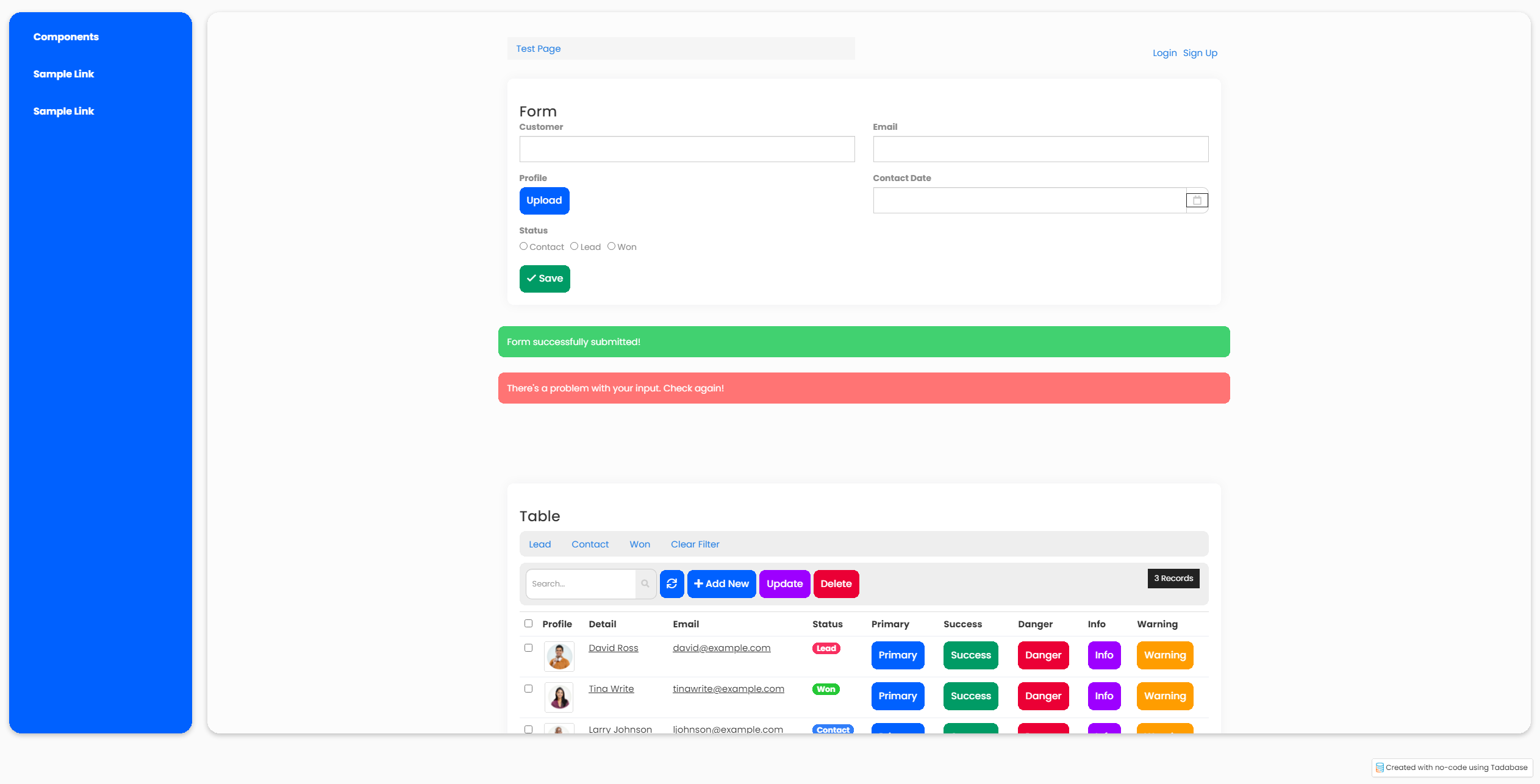
To install this theme on your app, copy the following code and paste in the Custom Header section of your app settings.
<link rel="preconnect" href="https://fonts.googleapis.com">
<link rel="preconnect" href="https://fonts.gstatic.com" crossorigin>
<link
    href="https://fonts.googleapis.com/css2?family=Poppins:ital,wght@0,100;0,200;0,300;0,400;0,500;0,600;0,700;0,800;0,900;1,100;1,200;1,300;1,400;1,500;1,600;1,700;1,800;1,900&display=swap"
    rel="stylesheet">

<style>
    /* App Background */
    body {
        background-color: #fafafa;
    }

    /* App Fonts */
    p,
    span,
    h1,
    h2,
    h3,
    h4,
    h5,
    h6,
    div,
    a {
        font-family: 'Poppins', sans-serif;
    }

    h3 {
        font-size: 24px;
        font-weight: 500;
        margin-bottom: 0;
    }

    label {
        font-size: 14px;
        color: #8b8b8b;
        font-weight: 600;
    }

    /* Buttons */

    .btn-primary,
    .btn.btn-primary {
        color: #fff;
        background: #0061FF;
        border: 2px solid #0061FF;
        padding: 9px 10px;
        border-radius: 1rem;
        text-align: center;
        text-decoration: none;
        font-weight: 500;
        font-size: 16px;
        outline: none;
    }

    .btn-primary:hover,
    .btn.btn-primary:hover {
        background-color: #fff;
        border-color: #0061FF;
        color: #0061FF;
    }

    .btn-primary:focus,
    .btn.btn-primary:focus,
    .btn-primary:active,
    .btn.btn-primary:active {
        background-color: #0061FF;
        border-color: #0061FF;
        color: #fff;
    }

    .btn-success,
    .btn.btn-success {
        color: #fff;
        background: #009B65;
        border: 2px solid #009B65;
        padding: 9px 10px;
        border-radius: 1rem;
        text-align: center;
        text-decoration: none;
        font-weight: 500;
        font-size: 16px;
        outline: none;
    }

    .btn-success:hover,
    .btn.btn-success:hover {
        background-color: #fff;
        border-color: #009B65;
        color: #009B65;
    }

    .btn-success:focus,
    .btn.btn-success:focus,
    .btn-success:active,
    .btn.btn-success:active {
        background-color: #009B65;
        border-color: #009B65;
        color: #fff;
    }

    .btn-danger,
    .btn.btn-danger {
        color: #fff;
        background: #EB0035;
        border: 2px solid #EB0035;
        padding: 9px 10px;
        border-radius: 1rem;
        text-align: center;
        text-decoration: none;
        font-weight: 500;
        font-size: 16px;
        outline: none;
    }

    .btn-danger:hover,
    .btn.btn-danger:hover {
        background-color: #fff;
        border-color: #EB0035;
        color: #EB0035;
    }

    .btn-danger:focus,
    .btn.btn-danger:focus,
    .btn-danger:active,
    .btn.btn-danger:active {
        background-color: #EB0035;
        border-color: #EB0035;
        color: #fff;
    }

    .btn-warning,
    .btn.btn-warning {
        color: #fff;
        background: #ff9d00;
        border: 2px solid #ff9d00;
        padding: 9px 10px;
        border-radius: 1rem;
        text-align: center;
        text-decoration: none;
        font-weight: 500;
        font-size: 16px;
        outline: none;
    }

    .btn-warning:hover,
    .btn.btn-warning:hover {
        background-color: #fff;
        border-color: #ff9d00;
        color: #ff9d00;
    }

    .btn-warning:focus,
    .btn.btn-warning:focus,
    .btn-warning:active,
    .btn.btn-warning:active {
        background-color: #ff9d00;
        border-color: #EC8ff9d00A21;
        color: #fff;
    }

    .btn-info,
    .btn.btn-info {
        color: #fff;
        background: #9d00ff;
        border: 2px solid #9d00ff;
        padding: 9px 10px;
        border-radius: 1rem;
        text-align: center;
        text-decoration: none;
        font-weight: 500;
        font-size: 16px;
        outline: none;
    }

    .btn-info:hover,
    .btn.btn-info:hover {
        background-color: #fff;
        border-color: #9d00ff;
        color: #9d00ff;
    }

    .btn-info:focus,
    .btn.btn-info:focus,
    .btn-info:active,
    .btn.btn-info:active {
        background-color: #9d00ff;
        border-color: #9d00ff;
        color: #fff;
    }

    /* Alerts */

    .alert-danger {
        background-color: #ff7474;
        border-radius: 10px;
        color: #ffffff;
        margin-top: 25px;
    }

    .alert-success {
        background-color: #41d170;
        border-radius: 10px;
        color: #ffffff;
        margin-top: 25px;
    }

    /* MENU */

    .app {
        padding: 4rem;
        margin-top: 2rem;
        margin-bottom: 2rem;
        background: #fcfcfc;
        height: 92vh;
        border-radius: 2rem;
        box-shadow: rgba(0, 0, 0, 0.24) 0 3px 8px;
        overflow: auto;
    }

    @media (min-width: 768px) {

        .navbar {
            bottom: 0;
            top: 0;
            left: 0;
            height: 92vh;
            overflow: inherit;
            position: fixed;
            width: 300px;
            z-index: 1049;
            border-radius: 2rem;
            margin-left: 15px;
            margin-top: 2rem;
            margin-bottom: 2rem;
            padding-top: 2rem;
            box-shadow: rgba(0, 0, 0, 0.24) 0 3px 8px;
        }

        .navbar-collapse {
            padding-right: 0;
            padding-left: 0;
        }

        .app {
            margin-left: 325px;
        }
    }

    .navbar-default {
        background-color: #0061FF;
        border-radius: 2rem;
        padding: 10px;
        border: none;
    }

    .navbar ul>li {
        font-size: 16px;
        font-weight: 700;
        margin: 5px 0 5px 10px;
        width: 93%;
    }

    .navbar-default .navbar-nav>li>a:hover,
    .navbar-default .navbar-nav>li>a:focus {
        text-decoration: none;
        color: #0061FF !important;
        background-color: #fff !important;
        border-radius: 15px;
    }

    .navbar-default .dropdown-menu>li>a:hover,
    .navbar-default .dropdown-menu>li>a:focus {
        text-decoration: none;
        color: #0061FF !important;
        background-color: #fff !important;
        border-radius: 15px;
    }

    .dropdown-submenu>a>span {
        font-size: 16px;
        font-weight: 700;
    }

    /* List Component */

    .list-body {
        border-radius: 10px;
        padding: 20px;
        margin: 10px 0 10px 0;
        background: #fff;
        box-shadow: 0 0 20px rgb(8 21 66 / 5%);
    }

    /* Form Component */

    .t-form {
        border-radius: 10px;
        padding: 20px;
        margin: 10px 0 10px 0;
        background: #fff;
        box-shadow: 0 0 20px rgb(8 21 66 / 5%);
    }

    /* Detail Component */

    .t-detail {
        border-radius: 10px;
        padding: 20px;
        margin: 10px 0 10px 0;
        background: #fff;
        box-shadow: 0 0 20px rgb(8 21 66 / 5%);
    }

    /* Search Component */

    .t-search {
        border-radius: 10px;
        padding: 20px;
        margin: 10px 0 10px 0;
        background: #fff;
        box-shadow: 0 0 20px rgb(8 21 66 / 5%);
    }

    /* Map Component */

    .t-map {
        border-radius: 10px;
        padding: 20px;
        margin: 10px 0 10px 0;
        background: #fff;
        box-shadow: 0 0 20px rgb(8 21 66 / 5%);
    }

    /* Accordion Component */

    .t-accordion {
        border-radius: 10px;
        padding: 20px;
        margin: 10px 0 10px 0;
        background: #fff;
        box-shadow: 0 0 20px rgb(8 21 66 / 5%);
    }

    /* Login Component */

    .t-logincomponent {
        border-radius: 10px;
        padding: 20px;
        margin: 10px 0 10px 0;
        background: #fff;
        box-shadow: 0 0 20px rgb(8 21 66 / 5%);
    }

    /* Signup Component */

    .t-signupcomponent {
        border-radius: 10px;
        padding: 20px;
        margin: 10px 0 10px 0;
        background: #fff;
        box-shadow: 0 0 20px rgb(8 21 66 / 5%);
    }

    /* Profile Component */

    .t-profilecomponent {
        border-radius: 10px;
        padding: 20px;
        margin: 10px 0 10px 0;
        background: #fff;
        box-shadow: 0 0 20px rgb(8 21 66 / 5%);
    }

    /* Table Component - Filter Tabs & Table Actions */

    .t-datatable .filter-tabs {
        margin: 10px 0 10px 0;
        border-radius: 1rem;
        background: #eee;
    }

    .nav-tabs {
        border: none;
    }

    .t-datatable .table-actions:nth-of-type(2) {
        margin: 10px 0 10px 0;
        padding: 10px;
        border-radius: 1rem;
        border: none;
    }

    /* Table Component */

    .t-datatable {
        border-radius: 10px;
        padding: 20px;
        margin: 10px 0 10px 0;
        background: #fff;
        box-shadow: 0 0 20px rgb(8 21 66 / 5%);
    }

    .table-wrap>.table tr {
        background-color: #fff !important;
    }

    table,
    table>thead>tr>th,
    table>tbody>tr>th,
    table>tfoot>tr>th,
    table>thead>tr>td,
    table>tbody>tr>td,
    table>tfoot>tr>td {
        border: none !important;
        padding-top: 1.5rem;
        padding-bottom: 1.5rem;
    }

    table>tbody>tr {
        border-top: 1px solid #EBEDF3;
    }

    /* Table Search */
    .input-group input.form-control.input-sm.padder {
        border-top-left-radius: 1rem;
        border-bottom-left-radius: 1rem;
        border-right: none;
        height: 50px;
    }

    .input-group-btn {
        border: 1px solid #cccccc;
        background: none;
        border-left: none;
        border-top-right-radius: 1rem;
        border-bottom-right-radius: 1rem;
    }

    .input-group-btn .btn {
        background: none;
        color: #cccccc;
        padding: 0px 10px;
    }

    .input-group-btn .btn:focus {
        outline: none;
    }

    .input-group-btn .btn:active {
        box-shadow: none;
    }
</style>