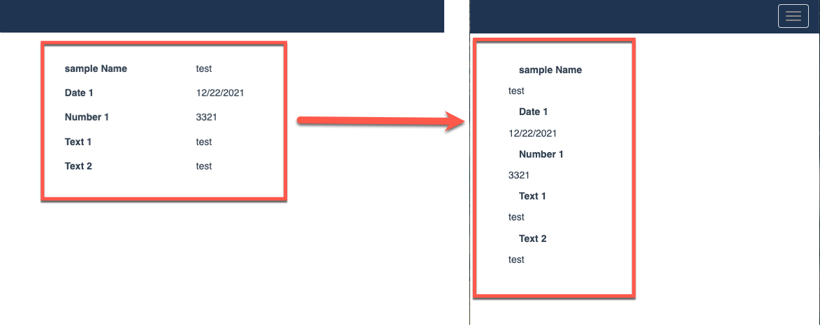
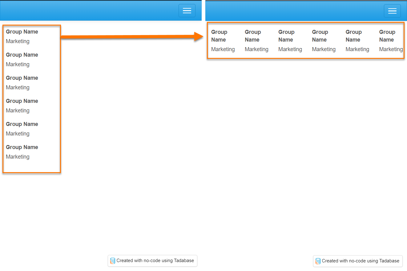
If you want to keep columns horizontal when working with mobile devices, you may use this code snippet.
Please click here for a quick video demonstrating how to set this up.
JavaScript Code
TB.render('component_ID', function(data) {
    data.ele.find('.small-screen-column').parent().parent().each(function(){
       var classList = this.className.split(/\s+/);
        for (var i = 0; i < classList.length; i++) {
            if (classList[i].contains('col-md')) {
                $(this).addClass(classList[i].replace('md','xs'));
            }
        }
    });
});