Is it possible for a landing page to recognise if the user is using a mobile device and therefore point them automatically to a page that has a layout specifically designed for mobile devices? I have seen this before on some sites where they have a “/m/” or equivalent in their url. not sure how to do this or if anyone has been able to achieve this simply?
Hi @JulianMc-
Tadabase is not designed to be mobile responsive. Others have carefully designed their applications to operate in a mobile-type environment however, the system is not designed to natively detect a mobile application and then adjust all settings.
From previous discussions (I asked the same question), this functionality is not high on the Tada Team list as it would be a massive resource commitment. Maybe in the future.
Hope this helps,
~Adam
1 Like
Thanks Adam, completely makes sense.
I think I might then create a landing page that can allow the user to navigate to either mobile or desktop friendly pages. Appreciate the feedback.
J
That is exactly what I’ve done. In essence, I created simplified pages that would work on a tablet…I never really got a nice configuration for a phone.
~Adam
@JulianMc @SafetyUniversity are you guys just talking about responsiveness on each screen size? Because you can still do that even if tadabase has limitation right now on that, what I do is to make a responsive menu/page/layout/ui design that will only show if it’s tablet, mobile and desktop which nowaways would be achievable.
@JulianMc yes, you can do some sort of work on that, depending on what screen they’re using which you will just add on your command (css) to show what page you’ve setup for mobile or desktop.
As for the “/m/” concern you have, if it’s just about functionality and layout(UI/UX) then create a page with only that specific ui that will show on certain page, just make sure to have different classes depending on the screen.
I have moved this thread to Tips and Tricks
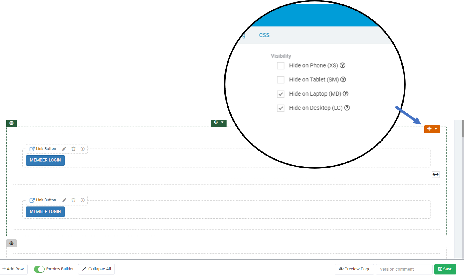
So I have worked a solution that is doing what I need it to. I also found that TD does have some recognition of mobile devices and can easily display or switch off fields depending on device.
I created a home page with two button components, with each linking to either mobile layout or to a laptop layout. I then go to the edit section for the component and tick the relevant “hide on” option so that only the appropriate login link button shows depending on the device used.
Works a treat!
1 Like