Hi all,
Here is an easy way to style text as an alert. You can do this anywhere you can add custom classes to text; however, it is recommended that you use this when displaying customized text using an HTML component.
The key here is to utilize these pre-defined CSS classes
.alert
combined with
.alert-success
.alert-info
.alert-warning
.alert-danger
For example
<p class="alert alert-danger">your_text_here</p>
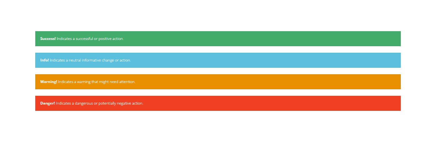
Here is a live example of all 4 alerts being used, as well as the code to achieve the same output in an HTML component.
<p class="alert alert-success"><strong>Success!</strong> Indicates a successful or positive action.</p>

<p class="alert alert-info"><strong>Info!</strong> Indicates a neutral informative change or action.</p>

<p class="alert alert-warning"><strong>Warning!</strong> Indicates a warning that might need attention.</p>

<p class="alert alert-danger"><strong>Danger!</strong> Indicates a dangerous or potentially negative action.</p>