UI/UX CSS works

Hi everyone, I have been trying to work on my task as UI/UX and it has been hard to get the proper classes to target and make my CSS changes effectively, my friend told me since it was already built the platform (tadabase) I need to find the documentation containing exactly what classes used on each component and other things so I can effectively make CSS changes. I’m still new, can anyone here in the community help me find those and give tips on my job as UI/UX and make my CSS workflow faster and accurate?

Thank you.

Welcome to Tadabase - the best method for finding CSS classes is to use the INSPECT function in your web browser - this link explains the process Click Here

1 Like

Yeah, but a lot of which has multiple classes so most of my trial went a mess since it targets multiple components at the same time.

What I would like to find is if you guys have some kinds of library or database of documentation maybe from tadabase itself that when we use css it targets only specific component and not the rest.

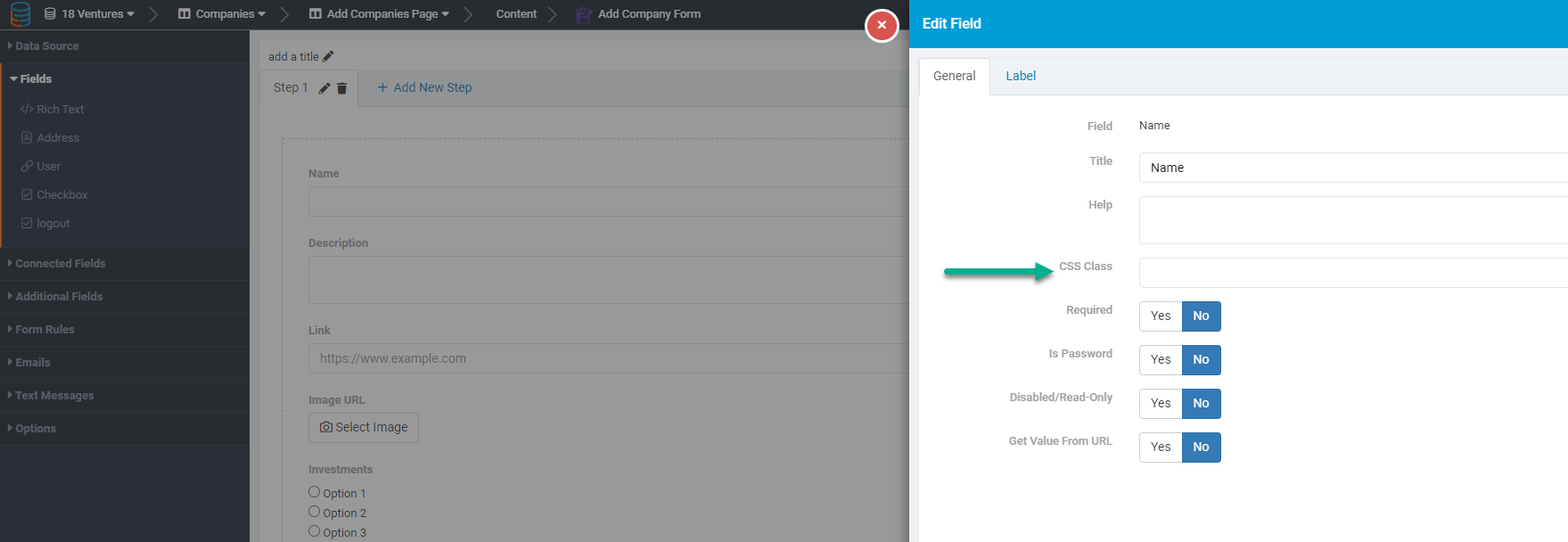
We are indeed working on optimizing and organizing our CSS. For example, in the coming days you’ll be able to add a custom CSS class to nearly any part of the app. From page all the way down to specific fields. For instance:

. In doing this you’ll be able to more easily apply custom styles to any part of your app. Like a radio field with icons:

But in general some helpful tips.

Every component is assigned a class prefixed with a “t”
For example:

  • t-forms
  • t-datatable
  • t-detail
  • t-signupcomponent
  • t-logincomponent
  • etc…

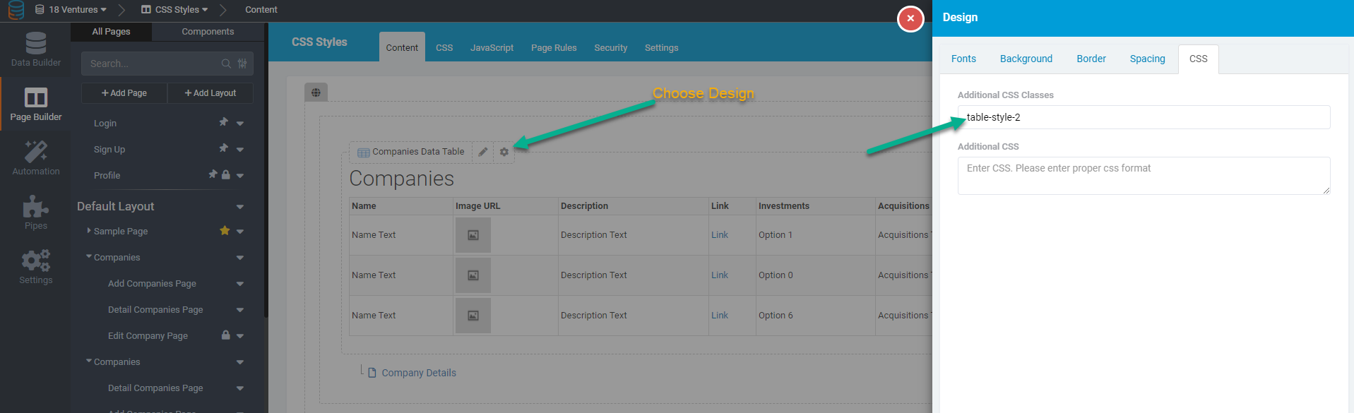
You can add custom CSS to replace all the default styling for any component by targeting this as the main class or create custom classes and add them as a class in the component settings.

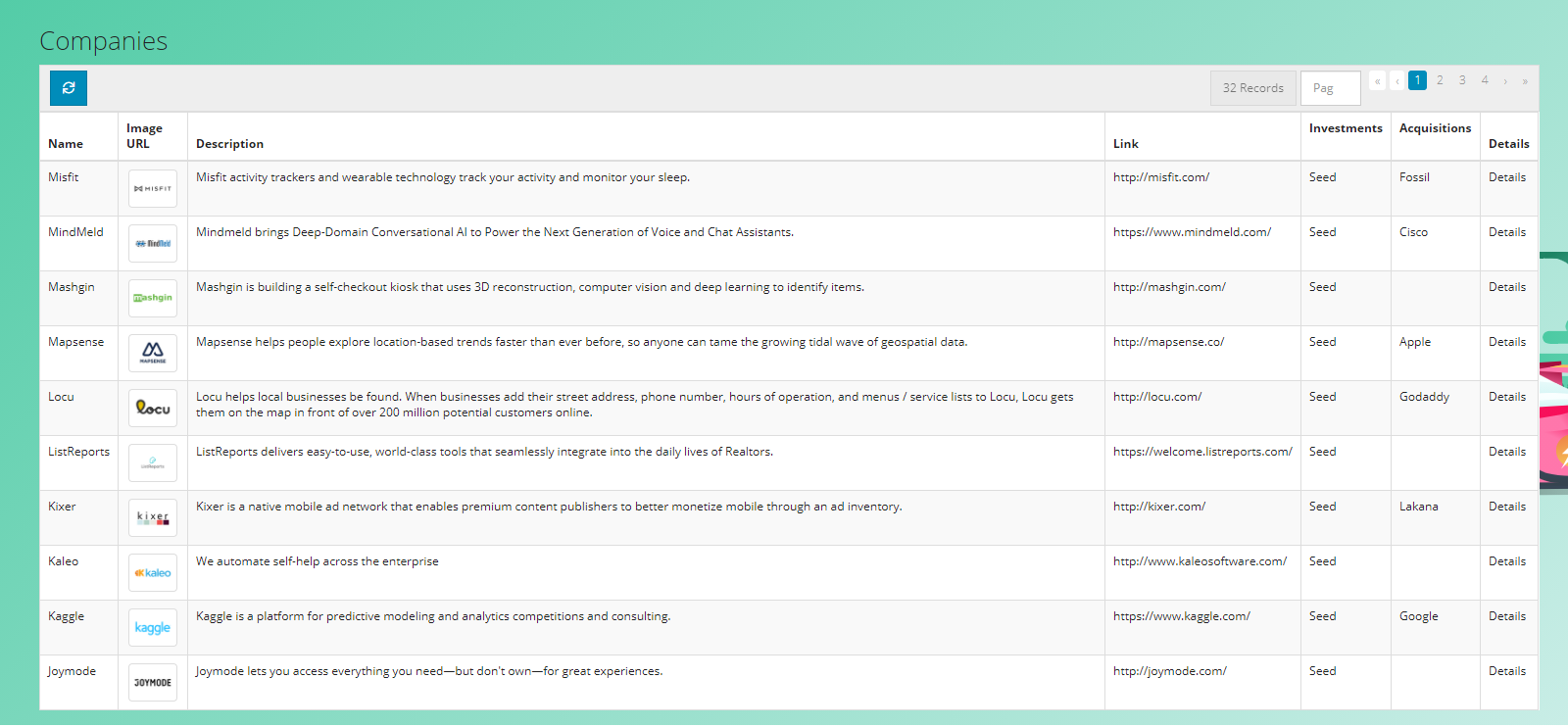
For example: suppose I have this generic table:

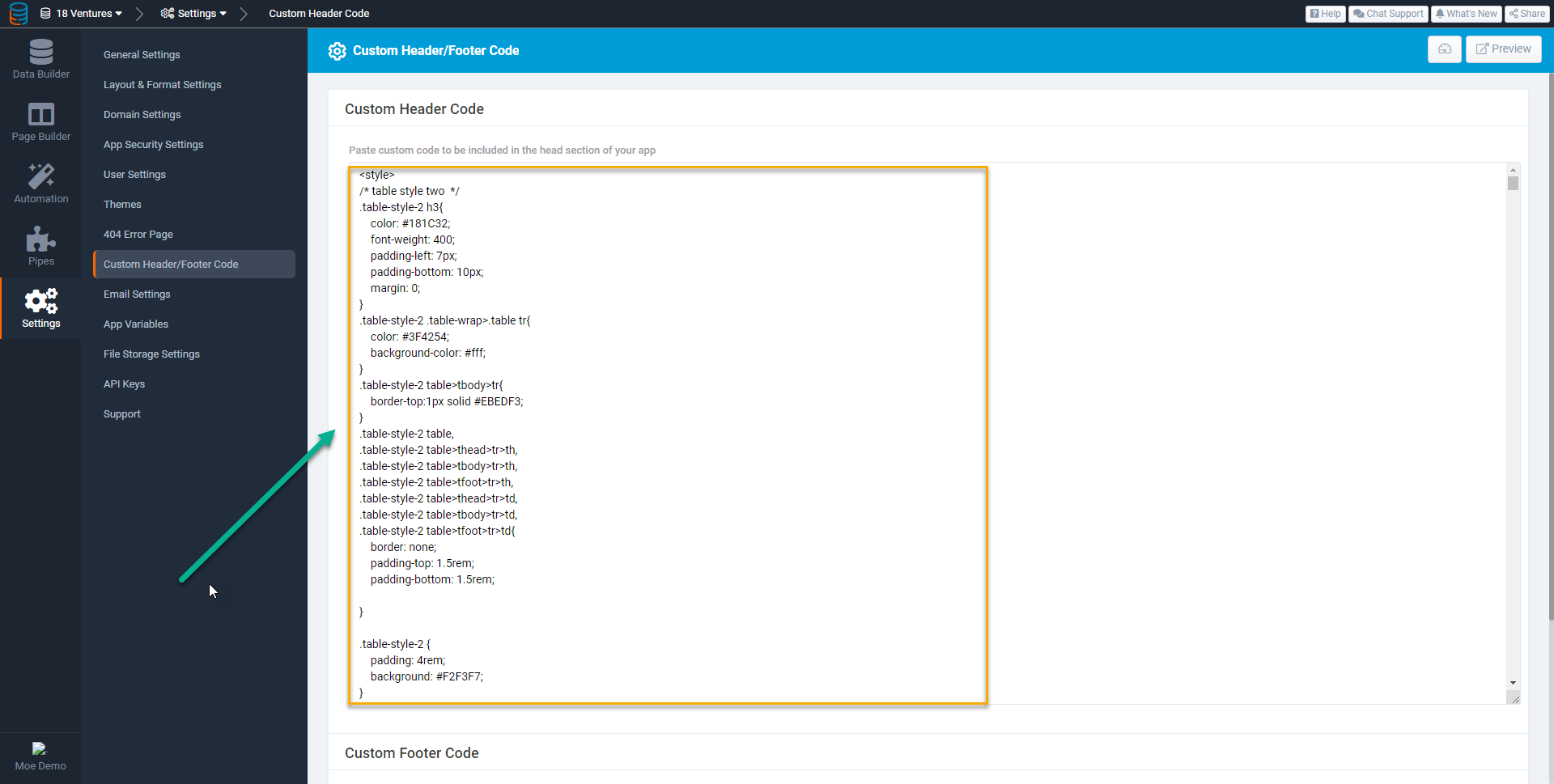
I can write some Custom CSS like this:

<style>
/* table style two  */

.table-style-2 h3 {
	color: #181C32;
	font-weight: 400;
	padding-left: 7px;
	padding-bottom: 10px;
	margin: 0;
}

.table-style-2 .table-wrap>.table tr {
	color: #3F4254;
	background-color: #fff;
}

.table-style-2 table>tbody>tr {
	border-top: 1px solid #EBEDF3;
}

.table-style-2 table,
.table-style-2 table>thead>tr>th,
.table-style-2 table>tbody>tr>th,
.table-style-2 table>tfoot>tr>th,
.table-style-2 table>thead>tr>td,
.table-style-2 table>tbody>tr>td,
.table-style-2 table>tfoot>tr>td {
	border: none;
	padding-top: 1.5rem;
	padding-bottom: 1.5rem;
}

.table-style-2 {
	padding: 4rem;
	background: #F2F3F7;
}

.table-style-2 table>tbody>tr>td {
	color: #3F4254;
	font-weight: 600;
}

.table-style-2 .table-responsive {
	/*border: 1px solid;*/
	border-radius: 1rem;
	background-color: white;
	padding: 1rem;
}

.table-style-2 a.td-link.td-data-link {
	background: #f3f6f9;
	padding: 8px;
	border-radius: 0.4rem;
}

.table-style-2 table>thead>tr>th {
	font-weight: 600;
	color: #B5B5C3 !important;
	font-size: 13px;
	text-transform: uppercase;
	letter-spacing: 2px;
	vertical-align: middle;
}

.table-style-2 .td-data-link i.fa {
	color: #3699FF;
}

.table-style-2 .td-data-link:hover {
	background: #3699FF !important;
	color: #fff;
}

.table-style-2 .td-data-link:hover i {
	color: white;
}

.table-style-2 table a:not(.btn) {
	text-decoration: none;
}

.table-style-2 .table-actions {
	border: none;
	background: none;
}


/* Check box css */

.table-style-2 input[type='checkbox'] {
	margin-top: -30px;
}

.table-style-2 input[type='checkbox'] {
	-webkit-font-smoothing: antialiased;
	text-rendering: optimizeSpeed;
	width: 24px;
	height: 24px;
	margin: 0;
	margin-right: 1px;
	display: block;
	float: left;
	position: relative;
	cursor: pointer;
}

.table-style-2 input[type='checkbox']:after {
	content: "";
	vertical-align: middle;
	text-align: center;
	line-height: 24px;
	position: absolute;
	cursor: pointer;
	height: 24px;
	width: 24px;
	left: 0;
	top: 0;
	font-size: 12px;
	-moz-box-shadow: inset 0 1px 1px #3699FF, 0 1px 0 #3699FF;
	background: #EBEDF3;
}

.table-style-2 input[type='checkbox']:hover:after,
input[type='checkbox']:checked:hover:after {
	background: #EBEDF3;
	content: '\2714';
	color: #fff;
}

.table-style-2 input[type='checkbox']:checked:after {
	background: #3699FF;
	content: '\2714';
	color: #fff;
}</style>

And I can paste this into the Custom Header Code:

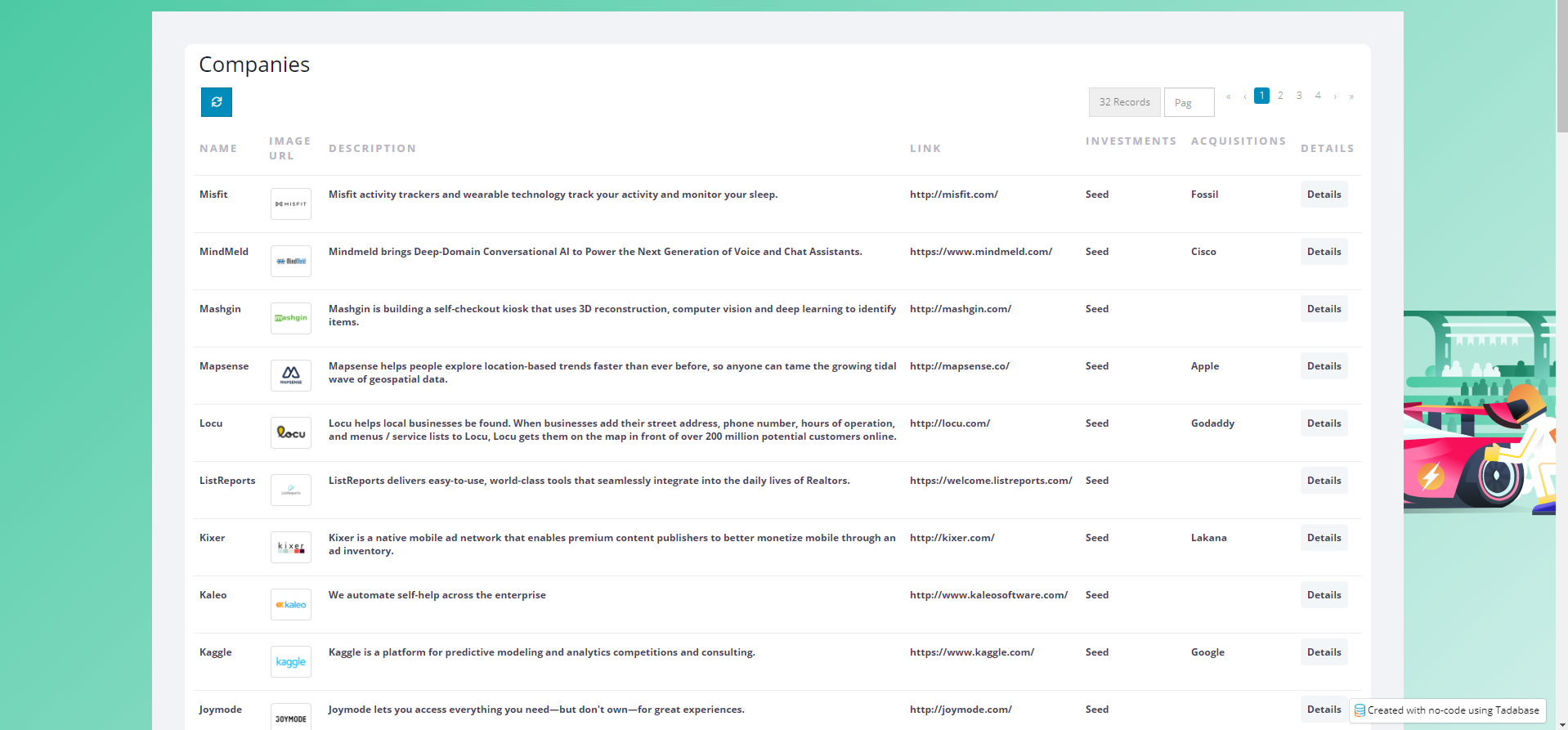
Now, anytime I add a CSS Class of table-style-2 to a table, it will apply this design.

Which in this case would look like this:

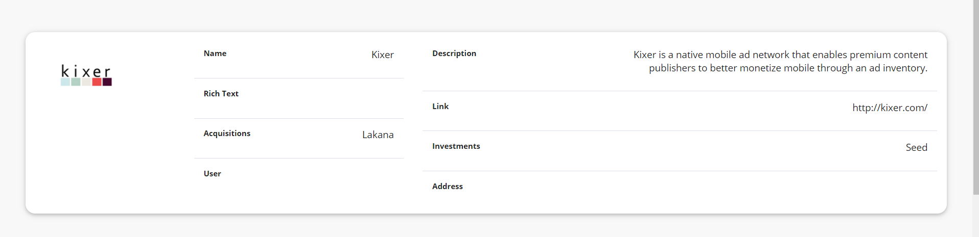
This same concept applies to any component, for example, here’s a details component with some Custom CSS:

If you want some custom styles to help you get started here’s 4 styles for tables, a few for forms and one for details. https://www.dropbox.com/s/u76ps3tmuo2im26/css-example.css?dl=0

If you’re pasting this in the head section make sure it has <style> in the beginning and the end </style>

If you prefer to apply these styles automatically to all your components, simply change the class from
details-style-1 to t-detail or table-style-3 to t-datatables

I hope this helps, let me know if there’s anything here I can clarify.

We are actively working on many design and configuration customizations that will make this easier in the long run.

4 Likes

I am beyond excited for this

Thank you, I will try to work on this and get back here again to see how I went with it.

1 Like

I have added the code to the header and it does not update the data tables. Any ideas?

/* table style two */

.t-datatables h3 {
color: #181C32;
font-weight: 400;
padding-left: 7px;
padding-bottom: 10px;
margin: 0;
}

.t-datatables .table-wrap>.table tr {
color: #3F4254;
background-color: #fff;
}

.t-datatables table>tbody>tr {
border-top: 1px solid #EBEDF3;
}

.t-datatables table,
.t-datatables table>thead>tr>th,
.t-datatables table>tbody>tr>th,
.t-datatables table>tfoot>tr>th,
.t-datatables table>thead>tr>td,
.t-datatables table>tbody>tr>td,
.t-datatables table>tfoot>tr>td {
border: none;
padding-top: 1.5rem;
padding-bottom: 1.5rem;
}

.t-datatables {
padding: 4rem;
background: #F2F3F7;
}

.t-datatables table>tbody>tr>td {
color: #3F4254;
font-weight: 600;
}

.t-datatables .table-responsive {
/border: 1px solid;/
border-radius: 1rem;
background-color: white;
padding: 1rem;
}

.t-datatables a.td-link.td-data-link {
background: #f3f6f9;
padding: 8px;
border-radius: 0.4rem;
}

.t-datatables table>thead>tr>th {
font-weight: 600;
color: #B5B5C3 !important;
font-size: 13px;
text-transform: uppercase;
letter-spacing: 2px;
vertical-align: middle;
}

.t-datatables .td-data-link i.fa {
color: #3699FF;
}

.t-datatables .td-data-link:hover {
background: #3699FF !important;
color: #fff;
}

.t-datatables .td-data-link:hover i {
color: white;
}

.t-datatables table a:not(.btn) {
text-decoration: none;
}

.t-datatables .table-actions {
border: none;
background: none;
}

/* Check box css */

.t-datatables input[type=‘checkbox’] {
margin-top: -30px;
}

.t-datatables input[type=‘checkbox’] {
-webkit-font-smoothing: antialiased;
text-rendering: optimizeSpeed;
width: 24px;
height: 24px;
margin: 0;
margin-right: 1px;
display: block;
float: left;
position: relative;
cursor: pointer;
}

.t-datatables input[type=‘checkbox’]:after {
content: “”;
vertical-align: middle;
text-align: center;
line-height: 24px;
position: absolute;
cursor: pointer;
height: 24px;
width: 24px;
left: 0;
top: 0;
font-size: 12px;
-moz-box-shadow: inset 0 1px 1px #3699FF, 0 1px 0 #3699FF;
background: #EBEDF3;
}

.t-datatables input[type=‘checkbox’]:hover:after,
input[type=‘checkbox’]:checked:hover:after {
background: #EBEDF3;
content: ‘\2714’;
color: #fff;
}

.t-datatables input[type=‘checkbox’]:checked:after {
background: #3699FF;
content: ‘\2714’;
color: #fff;
}

Not sure how that happened, but it seems that you have an extra s in all your class names.

If you can do a search and replace for all t-datatables and replaced it with t-datatable it should work.

1 Like

Thanks @moe - I copied the “t-datatables” from the solution post above. You might want to change it :slight_smile:

1 Like