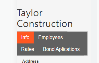
Does anyone know how to make tabs wrap onto a new line for small screens? Beyond about four tabs everything becomes a bunched mess on mobile.
@safetyinmind I’m stuck here as well
I have a solution for this, but it involves using the custom component and the W3.CSS framework instead of materialize. Let me know if you are interested and I’ll post it for you.
@SuiteUpstairs That would be great!
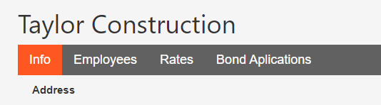
Here is what it looks like on desktop and mobile:
This tutorial assumes you have four sections that you would like to tab. if you have more or less, you will have to adjust this code.
Create a custom component details page. Doesn’t matter what the data Source is, it could be anything.
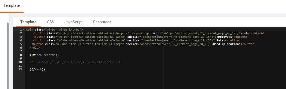
On the template tab of the custom component page paste the following (Note the x_element_page_xx_xx ID’s and update them to your IDs):
<div class="w3-bar w3-dark-grey">
    <button class="w3-bar-item w3-button tablink w3-large w3-deep-orange" onclick="openSection(event,'x_element_page_20_17')">Info</button>
    <button class="w3-bar-item w3-button tablink w3-large" onclick="openSection(event,'x_element_page_20_15')">Employees</button>
    <button class="w3-bar-item w3-button tablink w3-large" onclick="openSection(event,'x_element_page_20_13')">Rates</button>
   <button class="w3-bar-item w3-button tablink w3-large" onclick="openSection(event,'x_element_page_20_7')">Bond Aplications</button>
  </div>

  {{#each records}}

  <!-- Select fields from the left to be added here -->

  {{/each}}
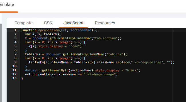
On the javascript tab of the custom component page paste this:
function openSection(evt, sectionName) {
  var i, x, tablinks;
  x = document.getElementsByClassName("tab-section");
  for (i = 0; i < x.length; i++) {
    x[i].style.display = "none";
  }
  tablinks = document.getElementsByClassName("tablink");
  for (i = 0; i < x.length; i++) {
    tablinks[i].className = tablinks[i].className.replace(" w3-deep-orange", "");
  }
  document.getElementById(sectionName).style.display = "block";
  evt.currentTarget.className += " w3-deep-orange";
}
Now save and close the custom component.
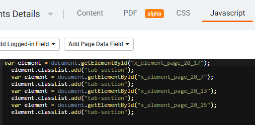
On the main javascript page, add the following and update the x_element_page_xx_xx ID’s)
var element = document.getElementById("x_element_page_20_17");
  element.classList.add("tab-section");
  var element = document.getElementById("x_element_page_20_7");
  element.classList.add("tab-section");
  var element = document.getElementById("x_element_page_20_13");
  element.classList.add("tab-section");
  var element = document.getElementById("x_element_page_20_15");
  element.classList.add("tab-section");
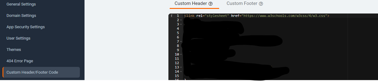
Finally, add this link to the Custom Header/Footer Code under the main app settings:
<link rel="stylesheet" href="https://www.w3schools.com/w3css/4/w3.css">
Here is the official w3.css framework tab section for more reference: w3.css Link
Good Luck!
This looks great. Do you know if can be centered?
Not easily
Thanks for sharing, this is really helpful!
The code looks similar to a custom table I built a while back. It is a full-size table on desktop and collapses down to a “card view” on mobile. Looking at your implementation, the only real difference is that yours swaps <tr> <td> for <button>
I’ll play with it a bit and see if I can make it work in Bootstrap grid. That should make it easier to center and give you more control over how it collapses on mobile.
Cool, let me know if you get it working, I’d be very interested in that.
Really interested to see that 