Has anyone had luck or can guide me on using more advanced and more visual charts? I need advanced charts to plot different values for each salesperson, now I can only show one line total.
Thank you
Has anyone had luck or can guide me on using more advanced and more visual charts? I need advanced charts to plot different values for each salesperson, now I can only show one line total.
Thank you
Were working on this.
Until its ready, do you have a specific charting library you wish to use? Ill make you a demo video on how to achieve this.
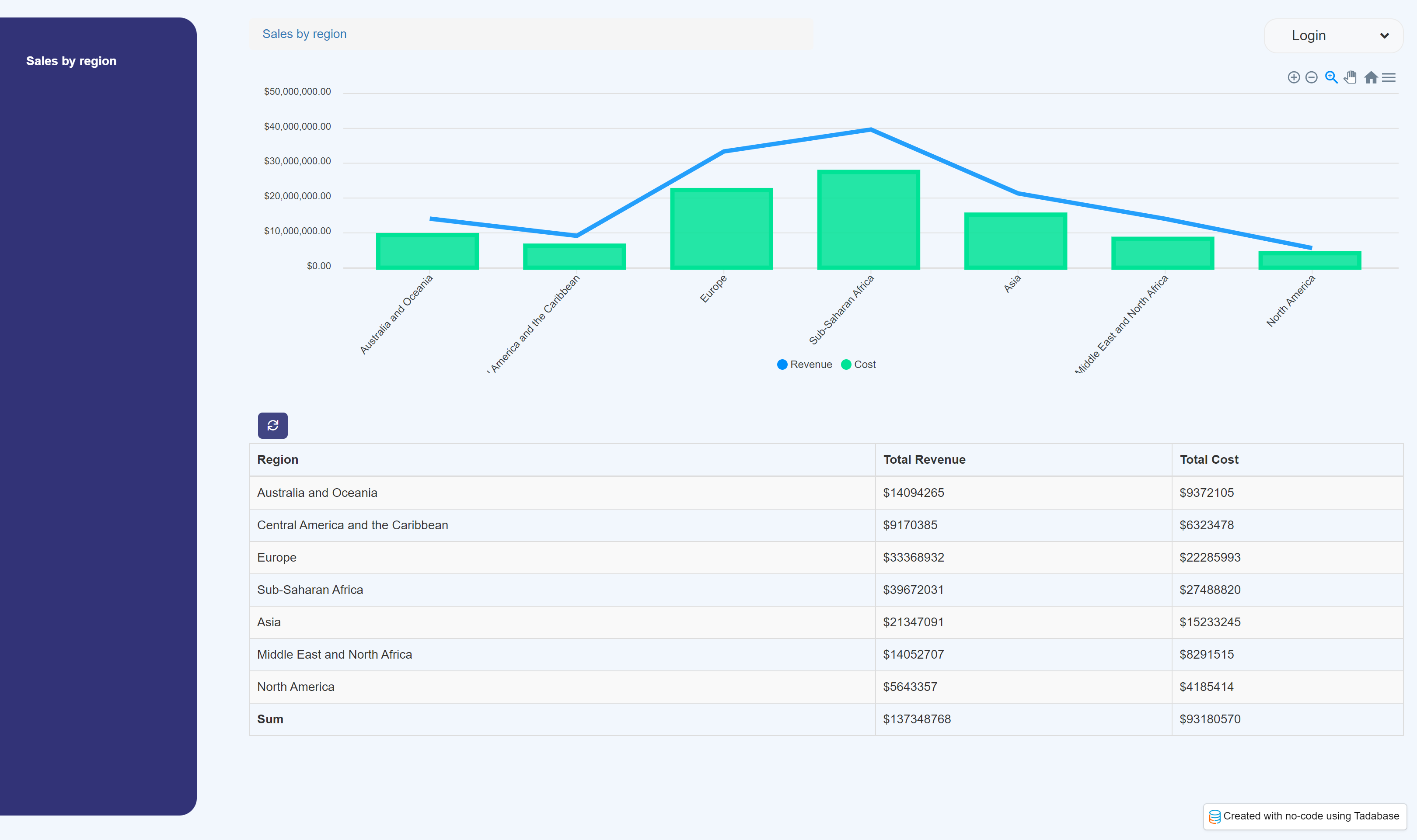
Found a great library and a somewhat easy way to do this. End result can look like this for example:
FIrst add this code to the Footer:
<script src="https://cdn.jsdelivr.net/npm/apexcharts"></script>
Then add some HTML in the page:
<div id="chart"> </div>
Javascript Code, don’t forget to update the component_ID to yours plus any other pointer changes necessary:
TB.render('component_3', function(data) {
// 	console.log(data);

	var column1 = data.columnData[0];
	var column2 = data.columnData[1];
	var column3 = data.columnData[2];
    console.log(column1);

    var options = {
      chart: {
        height: 350
      },
      series: [{
        type: 'line',
        name: 'Revenue',
        data: column2
      },
      {
        name: 'Cost',
        type: 'column',
        text: column1,
        data: column3
      }],

      yaxis: {
          labels: {
            formatter: function (value) {
              return formatter.format(value);
            }
          },
        },


      xaxis: {
        categories:column1,
        type: 'category',
        labels: {
         rotate: -48,
         rotateAlways: true,
        }
      }
    }

var chart = new ApexCharts(document.querySelector("#chart"), options);
chart.render();

});

var formatter = new Intl.NumberFormat('en-US', {
  style: 'currency',
  currency: 'USD',
});
Below is a quick and rough video walkthrough:

Moe-
If you all are looking at external charting library, I have fumbled around with Highcharts and Chartjs.
Adam
Thanks. Highcharts is what we actually now natively use on Tadabase. Some complaint we heard was that it looked a bit dated. ChartJS looks really nice too. This same method above can easily be applied to any charting software.
@SafetyUniversity
Did you use the same method which @moe outlines in the video? I am going to configure a chart on the app, and I really like ChartJS, since Highcharts indeed looks outdated.
I reverted to ChartJS and it has provided tha basic needs I have for the particular application.
Great video and clear explanation. I just have one question: the data is currently pulled from all the columns.
Is there a way to show the values from just one row in a chart ? E.g. a table with just one row, but with 30 columns with field values, which preferably should be displayed next to each other ( 30 charts horizontally displayed in eg a line chart)…
I cannot add the separate field (values) in the JS code ( only logged in fields).
I hope my question is clear. The video shows an explanation with columns, but for me it would be great to show 30 values from the same row in a chart.
Regards Martin
Update:
When displayed the chart on a details page, it’s possible to select the field values instead separetelyy…
@moe @Chem
I need some help with some custom JS code.
I am implementing Apex charts, which is great.
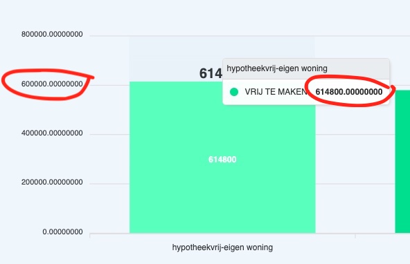
But the values from the columns are showed with more decimals then preferred.
How can I add the . as a thousand separator and remove the digits behind the comma? E.g. a 100.000 is shown as 100000,000000… These numbers behind the comma need to be removed and there needs to be a dot between 100 and the 0000… THis is the code which I now have:
var options = {
          series: [{
          name: 'HYPOTHEEK',
          data: ["{pageField.Hypotheek}", "{pageField.Hypotheek}", "{pageField.Hypotheek}"]

        }, {
          name: 'VRIJ TE MAKEN',
          data: ['{pageField.Xoutput_QSmaximaalmetmaandlast}','{pageField.Xoutput_QSmaximaalmetmaandlastbox3}','{pageField.Xoutput_QSsociomaximaal}','{pageField.Xoutput_QSmaximaallevius}']


        }],
          chart: {
          type: 'bar',
          height: 350,
          stacked: true,
          toolbar: {
            show: true
          },
          zoom: {
            enabled: true
          }
        },
        responsive: [{
          breakpoint: 480,
          options: {
            legend: {
              position: 'bottom',
              offsetX: -10,
              offsetY: 0
            }
          }
        }],
        plotOptions: {
          bar: {
            horizontal: false,
            borderRadius: 10,
            dataLabels: {
              total: {
                enabled: true,
                style: {
                  fontSize: '20px',
                  fontWeight: 900
                }
              }
            }
          },
        },
        xaxis: {
          categories:['{pageField.Xinput_naamaanbieder}-eigen woning','{pageField.Xinput_naamaanbieder} - vrije besteding','Overwaarde zonder maandlast', 'Verkoop en terughuur'
          ],
        },
        legend: {
          position: 'right',
          offsetY: 40,
          fontSize: '20px'
        },
        fill: {
          opacity: 1
        }
        };
        var chart = new ApexCharts(document.querySelector("#chart"), options);
        chart.render();

    var formatter = new Intl.NumberFormat('de-DE', {
      style: 'currency',
      currency: 'EUR',
      minimumFractionDigits: '0',
     maximumFractionDigits: '0',