Hi all,
I am having an issue regarding showing data to users in charts. Since I am unable to find a solution untill now, maybe someone else in the community has an idea how to do this:
Outline:
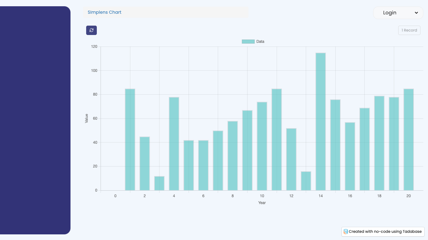
My user can view a movement schedule for 20 years. This movement schedule is generated as a pipe result and is individual to each user. Therefore it contains 20 field values (numbers).
In order to present this to the user in a nice view, a chart would be great. The x-axis should reflect the year (e.g. year 1 to year 20) and the y-axis should reflect the numbers. The results are showed on a details page. In order to show this I can choose 2 options:
Option1 :
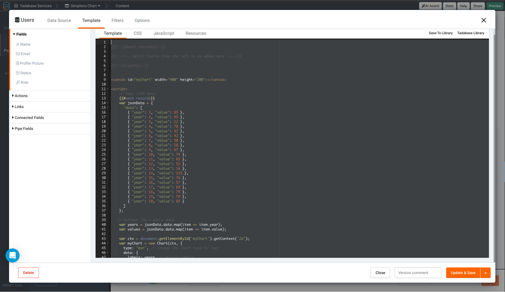
Use the default TB charts. Unfortunately, this is not possible. The chart component requires that the data shown is based on colum data. To generate the designated results: I would need to run a pipe, add/ insert a (connected table) row, name the row year 1 and record the pipe result (number) to a column.
If I wanted to do this for 20 years, I need to run the pipe 20 consecutive times (and simultaneously add 20 rows to the connected table). Though this is very time consuming for TB, it is also not possible to add multiple records containing different data ( the values from each year vary) in a single pipe request.
So as far as my knowledge goes, this is not possible.
Option2:
The other option is use the Apex Charts option. Since this enables me to manually manipulate the data in custom JS, I can now add one row with 20 field values (one row containing all the values). Working through this way. I can use the pipe, since the results can be added through a singe pipe request. This is because I show the data on a details page.
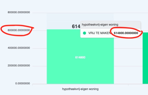
However, even though @moe did a great video on adding the Apex charts, the result is that the numbers in the table are not showing the same as in the TB currency fields (e.g. format as Euro, a dot as thousand separator and no decimals).
The custom JS I added contains the intl number format and min/ max digits, but unfortunately I am not able to customize this. I have added the custom JS code below:
So, untill now I haven’t been able to find a solution which is both suitable for TB and which is user friendly.
@SafetyUniversity Adam: do you have any recommendations based on your experience with TB Charts, Apex charts or Chart.js?
@GREDDIE , @Shumon : as experienced users, I am very interested in your opinion on this issue.
For the post containing the JS code and image of the current results: check https://community.tadabase.io/t/advanced-charts/2203/9?u=slimpens
var options = {
          series: [{
          name: 'HYPOTHEEK',
          data: ["{pageField.Hypotheek}", "{pageField.Hypotheek}", "{pageField.Hypotheek}"]

        }, {
          name: 'VRIJ TE MAKEN',
          data: ['{pageField.Xoutput_QSmaximaalmetmaandlast}','{pageField.Xoutput_QSmaximaalmetmaandlastbox3}','{pageField.Xoutput_QSsociomaximaal}','{pageField.Xoutput_QSmaximaallevius}']


        }],
          chart: {
          type: 'bar',
          height: 350,
          stacked: true,
          toolbar: {
            show: true
          },
          zoom: {
            enabled: true
          }
        },
        responsive: [{
          breakpoint: 480,
          options: {
            legend: {
              position: 'bottom',
              offsetX: -10,
              offsetY: 0
            }
          }
        }],
        plotOptions: {
          bar: {
            horizontal: false,
            borderRadius: 10,
            dataLabels: {
              total: {
                enabled: true,
                style: {
                  fontSize: '20px',
                  fontWeight: 900
                }
              }
            }
          },
        },
        xaxis: {
          categories:['{pageField.Xinput_naamaanbieder}-eigen woning','{pageField.Xinput_naamaanbieder} - vrije besteding','Overwaarde zonder maandlast', 'Verkoop en terughuur'
          ],
        },
        legend: {
          position: 'right',
          offsetY: 40,
          fontSize: '20px'
        },
        fill: {
          opacity: 1
        }
        };
        var chart = new ApexCharts(document.querySelector("#chart"), options);
        chart.render();

    var formatter = new Intl.NumberFormat('de-DE', {
      style: 'currency',
      currency: 'EUR',
      minimumFractionDigits: '0',
     maximumFractionDigits: '0',
Regards
Martin