Can we please get the ability to click a button on a created menu in the builder, similar to the “horizontal or vertical” button, that automatically creates a bottom menu for mobile browsers of the items in that menu?
Most apps always have a bottom nav bar. When I try to create this in Tadabase I have never been able to make it work properly.
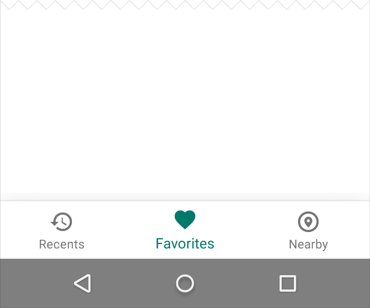
Here is an outline of what I am looking for: Bottom navigation - Components - Material Design
And a pic…
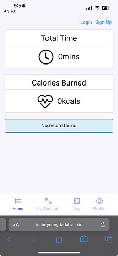
Hey @beaugast
I think I have some code for this that I’ve use in the past with an HTML component. I’ll take a look tomorrow and see if I can find it.
Just curious about your idea though, most Tadabase apps have rather large and complex menus - eg. 10 or more parent level items + a handful of child or grandchild items. How do you envision that working with a bottom navigation style? Most of the time when I encounter a bottom nav, there’s 3-5 menu items at most.
Or are you suggesting this would be applied to a secondary menu only?
My thoughts were that this should be extremely easy to do for existing users. I’d say make it a plugin but we can’t use those on layouts.
I have tried code from here…How To Create a Bottom Navigation Menu
and here…Make footer with menu stuck on bottom - #2 by Chem
and neither have worked so far.
Another option in the Menu Style as “Mobile” would allow a few seconds of clicking to create this without being forced to write code.
I’d love to see any code that you have that may help!
Edit; My suggestion is to create a separate menu for this. Not to use an existing complex one. Maybe limit it to a specific number of links and only top-level links. No sub-level menu items allowed on a Mobile Menu.
Found the app I built it for. Pretty sure it’s an html component.
I’m curious why we don’t allow plugins in layouts - that seems like it’d be easy enough to do.
1 Like
That is exactly what I am looking for. Are you willing to share the code from that?
Absolutely! I’ll find this first thing tomorrow morning.
2 Likes
@beaugast
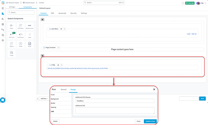
I have an HTML component placed, in a row, below the page container in my layout.
The row highlighted in red has a custom css class of fixedMenu
Here is the HTML for the HTML Component
<div class="menuContainer">
    <nav class="menu">
        <a class="menu-item menuLink" href="#">
            <span class="material-icons">format_list_bulleted</span>
            <span class="menu-item-label">Home</span>
        </a>
        <a class="menu-item menuLink" href="https://timyoung.tadabase.io/workout-tracker#!/my-routines">
            <span class="material-icons">fitness_center</span>
            <span class="menu-item-label">My Workouts</span>
        </a>
        <a class="menu-item menuLink" href="https://timyoung.tadabase.io/workout-tracker#!/log">
            <span class="material-icons">insert_chart</span>
            <span class="menu-item-label">Log</span>
        </a>
        <a class="menu-item menuLink" href="https://timyoung.tadabase.io/workout-tracker#!/profile">
            <span class="material-icons">account_circle</span>
            <span class="menu-item-label">Profile</span>
        </a>
    </nav>
</div>
Here is the CSS used:
.fixedMenu {
  overflow: hidden;
  position: fixed;
  bottom: 0;
  width: 100%;
  z-index: 999;
}

.menu {
  display: flex;
  justify-content: space-evenly;
  height: 72px;
  max-width: 100%;
  overflow: hidden;
  background-color: #fff;
  box-shadow: 0 0 1px 0 rgba(52, 46, 173, 0.25), 0 15px 30px 0 rgba(52, 46, 173, 0.1);
}

.menu a {
  text-decoration: none;
}

.menu-item {
  display: flex;
  flex-direction: column;
  justify-content: center;
  align-items: center;
  text-decoration: none;
}

.menu-item:focus,
.menu-item:hover {
  outline: none;
}
.menu-item:focus .material-icons,
.menu-item:hover .material-icons {
  font-family: "Material Icons";
  color: #342ead;
}
.menu-item:focus .menu-item-label,
.menu-item:hover .menu-item-label {
  color: #342ead;
}

.material-icons {
  font-family: "Material Icons Outlined";
  display: block;
  margin-bottom: 4px;
  font-size: 26px;
  color: #aeabde;
  transition: 0.25s ease;
}

.menu-item-label {
  display: block;
  font-size: 13px;
  color: #c2c0e6;
  transition: 0.25s ease;
}
<link href="https://fonts.googleapis.com/icon?family=Material+Icons" rel="stylesheet">
Is that the correct stylesheet reference for the header to get the icons to display?
Edit:
Figured this out… These two need to be included…
<link href="https://fonts.googleapis.com/icon?family=Material+Icons+Outlined" rel="stylesheet" />
<link href="https://fonts.googleapis.com/icon?family=Material+Icons" rel="stylesheet" />```
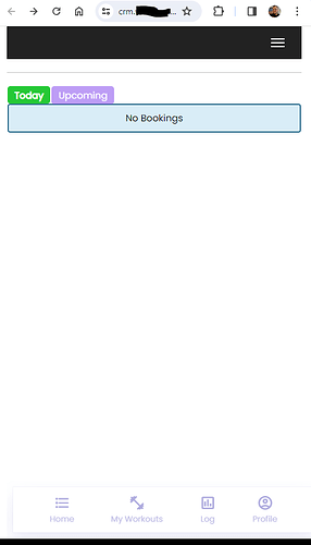
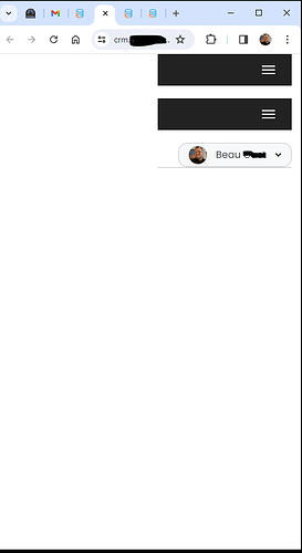
And the issue I’ve always had is still here BUT I’ve narrowed it down to potentially being a Tadabase template issue now. Your fitness tracker app is using the Cosmo template. I’m using the Atlas template. The Atlas template for whatever reason introduces a gap at the left side of this.
And on a mobile phone sized screen…
@tim.young how do I get rid of that gap on that template or is this a bug in the template itself?
I have also noticed that any custom theme that has a vertical menu set has this spacing issue when sizing the browser window down or viewing on mobile browsers.
@tim.young @moe is this a template bug? Or am I doing something wrong here?
@beaugast I haven’t seen this problem with the native Tadabase menu. When testing, you should refresh your browser after changing the viewport width, that will reload the CSS.
