Borrowing inspiration from the excellent design shared by @SafetyUniversity in his post Custom Card Component Design , I’ve developed (with a lot of help from ChatGPT) a similar visual style, but this version uses only standard Tadabase cards (no custom components or HTML needed).
Here’s a before-and-after comparison of how it looks…
BEFORE (default Tadabase)
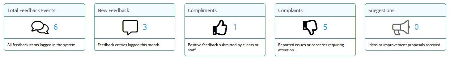
AFTER (with CSS applied)

A few notes about how it works:
-
The CSS overrides Tadabase’s default icon colour rules, fixing the icon position on the left and right-aligning all text and numbers.
-
The default colour (
#FF6600) orange matches my branding, but you can easily swap this for your own brand colour. -
Header and footer dividers are removed, giving a flatter, cleaner layout.
-
Card height and padding are reduced, producing a more compact appearance.
-
Icons and values darken slightly on hover to add subtle interactivity.
-
The shadow depth has been standardised to a mid-level (≈2) for consistency across dashboards.
-
Header and footer text are sized as a heading and a subheading.
This CSS provides a crisp, lightweight alternative to the HTML-based custom card layouts, while remaining fully compatible with the standard Tadabase card structure. Just paste the following code into your page’s CSS section.
Here is the code:
/* =================================
Global Card Styling (Compact, Right-Aligned)
=================================== *//* ===== Header ===== /
.t-card-header {
border-bottom: none !important;
background-color: white !important;
padding: 2px 6px !important;
margin-bottom: 0 !important;
text-align: right !important; / Right-align text globally */
color: #333333 !important;
font-weight: 500 !important;
}/* ===== Footer ===== /
.t-card-footer {
border-top: none !important;
background-color: white !important;
color: #666666 !important;
font-size: 11px !important;
padding: 2px 6px !important;
margin-top: 0 !important;
text-align: right !important; / Right-align footer text */
}/* ===== Card Content ===== /
.con.left-icon {
display: flex !important;
align-items: center !important;
justify-content: flex-start !important; / Icon left, text group right /
gap: 0 !important;
padding: 2px 6px !important;
margin: 0 !important;
text-align: right !important; / Right-align text content */
}/* ===== Icon ===== /
.con.left-icon i {
flex-shrink: 0;
margin-right: 8px !important;
font-size: 40px !important; / Global icon size /
color: #FF6600 !important; / Hygex orange */
transition: color 0.2s ease-in-out;
}/* === Prefix / Value / Suffix === /
.con.left-icon span.t-card-prefix,
.con.left-icon span.t-card-value,
.con.left-icon span.t-card-suffix {
display: inline-block !important;
margin: 0 !important;
padding: 0 !important;
color: #FF6600 !important; / Default orange for all text */
letter-spacing: normal !important;
word-spacing: normal !important;
}/* ===== Push Text Group to Right ===== /
.con.left-icon span.t-card-prefix {
margin-left: auto !important; / Moves group to right side */
}/* ===== Number Value Formatting ===== /
.con.left-icon span.t-card-value {
min-width: 2ch !important; / Keeps number width stable */
text-align: right !important;
font-weight: 500 !important;
}/* ===== Hover Darken Effect ===== /
.t-card:hover .con.left-icon i,
.t-card:hover .con.left-icon span.t-card-value {
color: #cc5200 !important; / Slightly darker orange on hover */
}/* ===== Shadow & Shape ===== /
.af-card-component,
.t-card {
background: white !important;
border: none !important;
border-radius: 10px !important;
box-shadow: 0 2px 6px rgba(0, 0, 0, 0.15) !important; / Depth-2 */
transition: box-shadow 0.2s ease-in-out;
}/* ===== Hover Shadow Emphasis ===== */
.t-card:hover {
box-shadow: 0 3px 8px rgba(0, 0, 0, 0.22) !important;
}/* ===================
End of Global Card Styling
==================== */