Would be really cool if there could be tooltips for help descriptions on the live app or pop up cards to display record data on hover.
@tim.young, I would support this suggestion whole hearted.
~Adam
one more vote! I’m finding ways to work on tooltips too
Something like this would be very helpful! It opens on hover.
Where would you want to see these tooltips?
I think making it an option on any type of button (actions/submit/link) would be cool.
I’d say anywhere that would be useable where you can add “help” text for fields. Maybe a “?” upper right corner of a field label.
Yep, this get my vote too
Here’s 2 methods of creating tooltips if anyone is interested.
Thank you @tim.young These are very helpful!
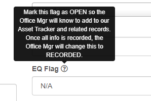
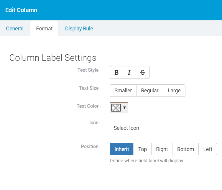
We can show tooltips in Edit Components and in Form Components. It would be helpful to have the option to do this in Details Components as well.
You can add something like below
Step 1 : Add css class to your element

Step 2 : Add css
.tooltip-css{
background: #333;
background: rgba(0,0,0,.9);
color: #fff;
content: attr(title);
width:20%;
padding: 5px;
text-align: center;
border-radius:5px;
}
Step 3 : Add code to javascript
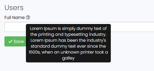
TB.render(“component_7”, function (data) {
$(".custom-icon label .lbl").after('<i class="far fa-question-circle custom-tooltip" data-toggle="tooltip" data-placement="right"></i>');

let tooltipText = `Lorem Ipsum is simply dummy text of the printing and typesetting industry. Lorem Ipsum has been the industry's standard dummy text ever since the 1500s, when an unknown printer took a galley`;

$(".custom-tooltip").attr('title', tooltipText);

$('[data-toggle="tooltip"]').tooltip({

    tooltipClass: "tooltip-css"

})
});
Result :
@ashnil
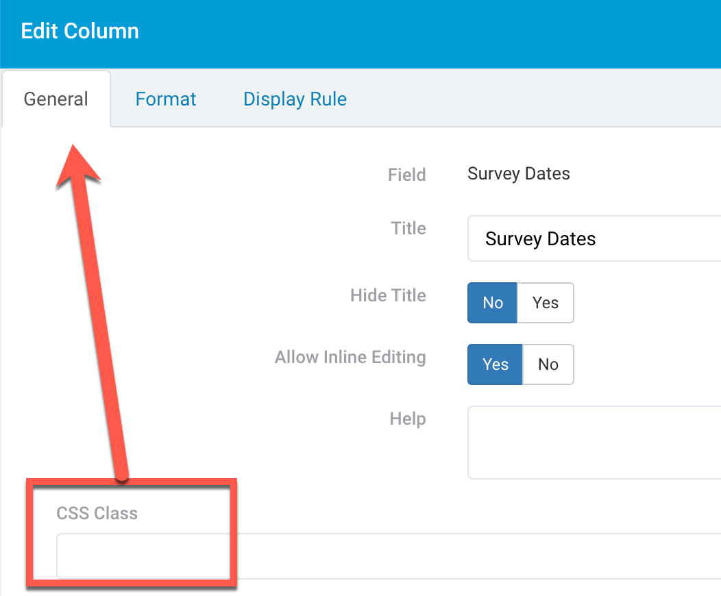
I think I’m missing something on the first step. I am editing an element in a details form, but I don’t see the CSS Class option.
@Henry -
I checked the details component on my end and I see the CSS Class filed where custom classes can be added. The field is under the “General” tab.
Are you looking at a form or a details component? You refer to both in your post.
~Adam
Hi Adam,
The Tool Tips do work in the Form component. I was referring to the Details component.
Thanks for your help!
Henry
Hey @Henry,
@SafetyUniversity’s post is correct about the location of the Custom CSS input when editing a field in a Details Component. Are you not seeing it there?
@ashnil’s code will need to be modified to work in a details component for what it’s worth.
Hi - it would be great if you make a possibility for tooltips within buttons standard.
Where to add:

It will work such that you focus your mouse pointer on a button, a small balloon will pop-up with the (short) content of the tooltip.
Big advantage: you do not need to give descriptions to your button, so it becomes big. Tooltip save a lot of space, for example in a big table component.
Great idea!
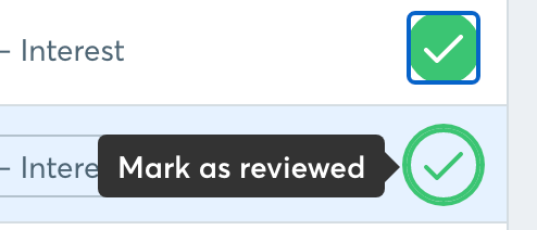
It would be cool if we could add a bubble help on ‘hover’ over an action link button in a table row. So users would know what the button does.
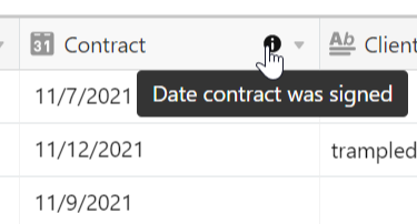
I see we’ve got tooltips for forms (and maybe detail components — haven’t tried that yet). Would be great if this were possible for columns in a table, as well. Here’s an example from Airtable. As you can see, this makes it possible to keep the column title brief, but provide a fuller description of the field if the user hovers over the little ‘info’ circle.