This will be my final entry to the saga that is a side bar navigation menu. The other posts I’ve made got pretty scattered because I was trying different methods. And then I completely botched my Loom account and lost the videos that were on each thread. The videos contained useful information so those posts are now incomplete. They will be closed, and redirected here. You can follow the chain of events here…
1st post: Sidebar and/or vertical menu
2nd post: Static Side Bar
3rd post: Side Navigation Menu
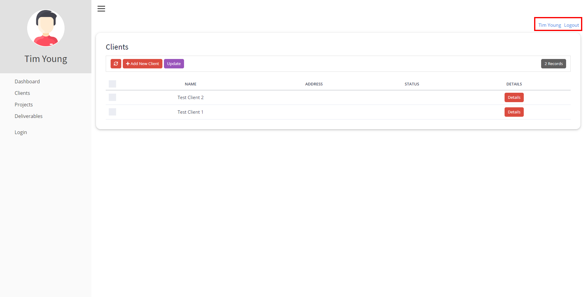
So now we’re here and this should be pretty straight forward as it’s the easiest version of a sidebar that I’ve done. Let us begin.

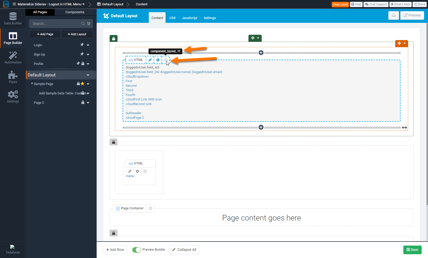
Example Image
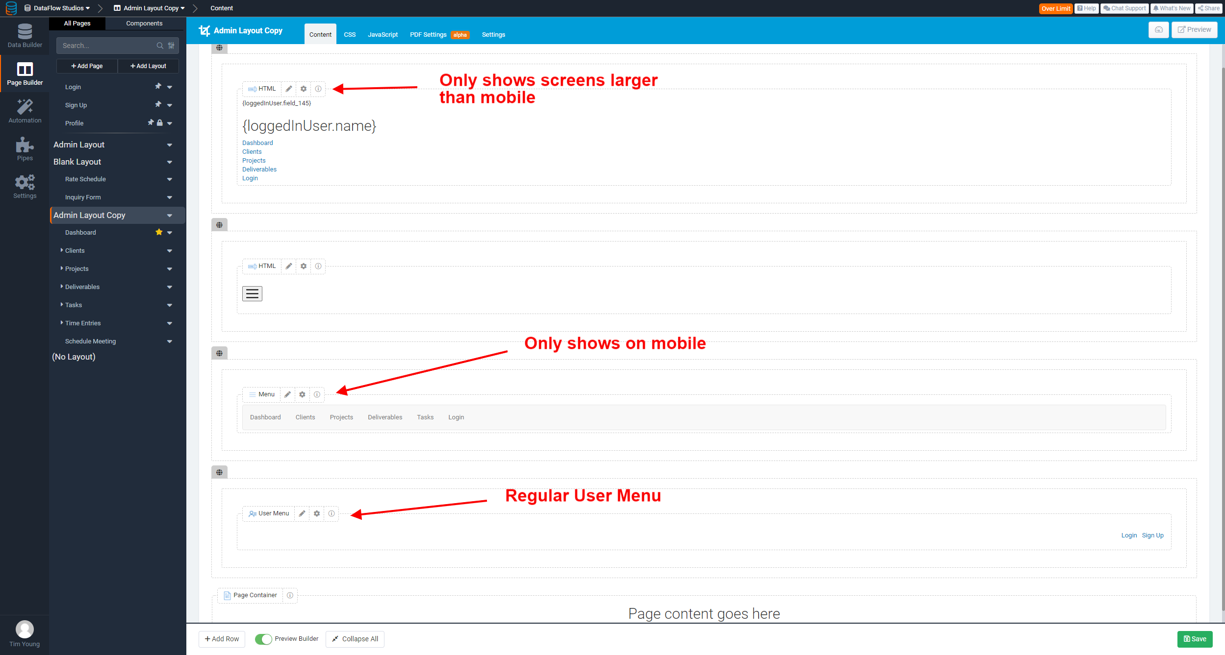
Step 1 - Components & HTML
Steps:
- Create 2 rows on a layout
- Top row contains the Menu HTML
- Click the Row settings and give it a custom css class of “sidenav” - no quotes, just the text
- Second row contains a button to toggle the menu
- In my case, I also created a regular menu to show on mobile only
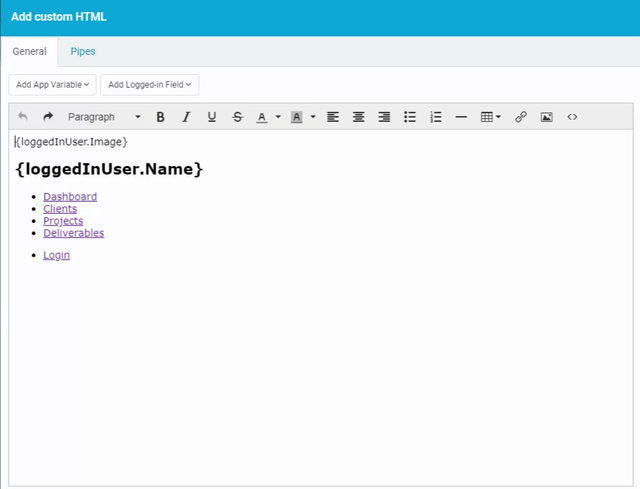
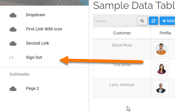
Menu Row - HTML Component
<nav class="menu">
<header class="avatar">{loggedInUser.Image}
<h2>{loggedInUser.Name}</h2>
</header>
<ul>
<li class="menuLink"><a href="https://yourapp.com/page1">Page 1</a></li>
<li class="menuLink"><a href="https://yourapp.com/page2">Page 2</a></li>
<li class="menuLink"><a href="https://yourapp.com/page3">Page 3</a></li>
<li class="menuLink"><a href="https://yourapp.com/page4">Page 4</a></li>
</ul>
<ul>
<li class="menuLink"><a href="https://yourapp.com/login">Login</a></li>
</ul>
</nav>
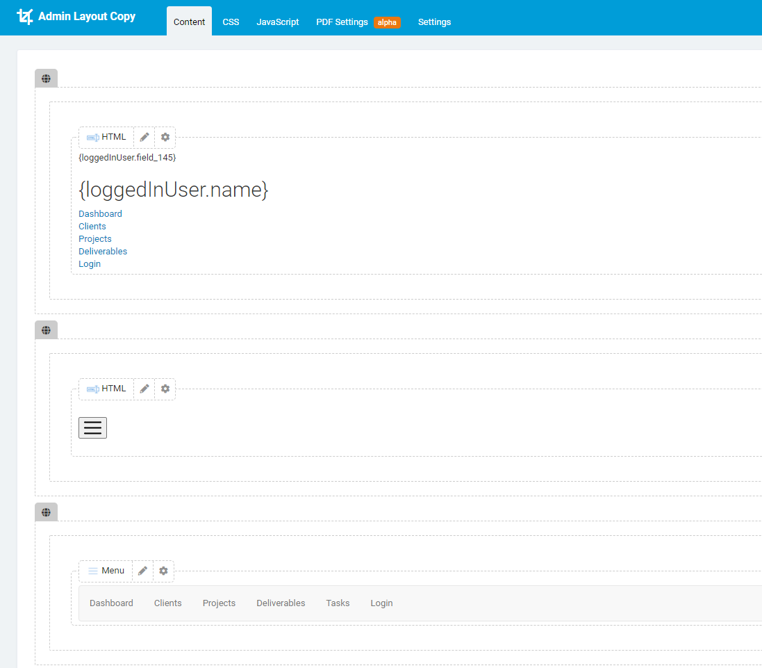
Toggle Button Row - HTML Component
<p style="text-align: left;"><button id="toggle" class="btn-nav"><img src="https://www.flaticon.com/svg/static/icons/svg/1828/1828859.svg" width="25px" height="25px" /></button></p>
You can use any image here. I pulled this from FlatIcon for example.
Step 2 - Layout CSS
Add this to your Layout CSS page/* --- Sidenav Toggle Button --- */
.btn-nav {
background-color: transparent;
border: none;
padding: 5px;
}
.btn-nav:hover {
/*background-color: #674ea7;*/
border-radius: 25px;
}
.btn-nav:focus {
outline: none;
}
/* --- Image and Thumb Wrap - used for sidenav avatar --- */
.thumb-wrap {
max-width: 125px;
max-height: 125px;
overflow: hidden;
margin: auto;
}
.thumb-wrap img {
max-height: 125px;
max-width: 125px;
margin: 0 auto;
display: block;
padding: 2px;
background-color: #fff;
height: auto;
}
/* ===================================================================================================================== */
/* --- BEGIN SIDENAV --- */
/*This moves the whole application over the width of the sidebar that is set under '.menu' These values need to match */
@media only screen and (min-width: 768px) {
.app {
margin-left: 300px;
}
}
.app-nav {
margin-left: 0px;
}
/* This is toggled with a button to "close" the sidenav */
.menuhide {
display: none;
}
/* Menu Settings */
.menu {
color: white;
background: #FAFAFA;
height: 100vh;
width: 300px;
position: fixed;
top: 0;
left: 0;
z-index: 5;
outline: none;
}
.menuLink a {
color: #3c3c3c;
padding: 0.5em 1em 0.5em 3em;
width: 100%;
display: block;
text-decoration: none;
font-size: 16px;
}
.menuLink a:hover {
background-color: rgba(0, 0, 0, 0.1);
}
.menuLink a:focus {
background-color: rgba(0, 0, 0, 0.1);
}
.menu .avatar {
background: rgba(0, 0, 0, 0.1);
padding: 2em 0.5em;
text-align: center;
}
.menu .avatar img {
border-radius: 50%;
overflow: hidden;
/*border: 4px solid #02dcff;*/
}
.menu .avatar h2 {
font-weight: normal;
margin-bottom: 0;
color: #3c3c3c !important;
}
.menu ul {
list-style: none;
padding: 0.5em 0;
margin: 0;
}
.menu ul li {
font-size: 0.95em;
font-weight: regular;
transition: all 0.15s linear;
cursor: pointer;
}
.menu ul li:focus {
outline: none;
}
Step 3 - Layout JavaScript
Add this to your Layout JavaScript page$('#toggle').click(function(){
$('.sidenav').toggleClass('menuhide');
$('.app').toggleClass('app-nav');
});
THE END
So unless I’ve made some glaring mistakes here, that should be everything. Pretty straight forward and configurable.